11 Tips For Effective Calls to Action in HTML Emails
Reading Time: 4 minutesThis article was last updated on September 7, 2020
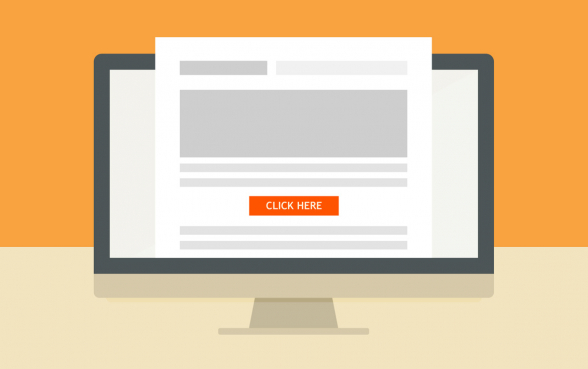
Having an effective call to action is essential part of any email marketing campaign. After reading your email, your subscribers should have a clear idea what to do next. Big, well positioned call to action, featuring the right copy will help them decide.
Your call to action button consists of two elements: design and copy. Both elements play different, but equally important roles in the conversion process.
Your call to action design is meant to attract readers’ attention. It answers the question “Where should I click?“
Your call to action copy gives a specific reason to click it. It answers the question “Why should I click?“
These are our 11 tips for designing effective calls to action for your HTML emails.
1. Make Your Call to Action Big
When a person opens an email, one of the first things that they should see is the call to action. Not to mention that readers typically just quickly scan the email, rather than reading it all. This is why you need to make your call to action very noticeable. Make sure the button is big enough to stand out and catch the reader’s attention, but don’t go overboard with it.
2. Use a Clear Message in Your Call to Action
The call to action should be concise and one that clearly tells your email subscribers what action they are taking. Naturally it is easier to use a generic line like `buy now` or `sign up`, however, calls to action that are related to your product or service tend to convert better than generic ones.
Our advice is to try using text that is highly related to what you are offering or selling with your email.
3. Hint Value in Your Message
Explain your email reader not what they have to do, but what they are going to get when they hit your call to action. For example, change the button copy from “Order Information and Prices” to “Get Information and prices”.
The word “Order” emphasizes what you have to do, while, “Get” talks value as it emphasizes what you’re going to get – rather than what you have to do to get it.
4. Write the Copy in First Person
Make your email sound like if it was designed especially for that particular person. Instead of saying “Edit Your Profile”, better say “Edit My Profile”. Writing in first person helps for a more immersive user experience.
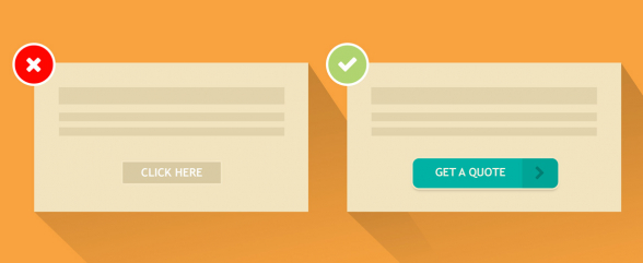
5. Make Your Call to Action Look Clickable
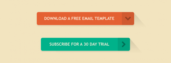
To get more clicks your buttons should look like buttons. Here we have few tips to help you make the buttons in your email look clickable:
- Shape – rectangle;
- Clear boundaries and borders;
- Put white space around your button;
- Use a contrasting color.
6. Call to Action Position
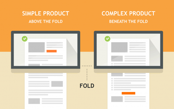
It is a classic rule in email design that the call to action goes “above the fold”. However, as a result of extensive testing we came to the conclusion that the optimal position for a call to action really depends on the complexity of your offer.
If your product is really straight forward and needs no detailed explanation, sure, place the call to action above the fold. No need to make your readers scroll down to the bottom.
However, if you present a complex product or a brand new service and you need more space to introduce the reader to it, it is better that you let him read through your message and just then ask him to act upon it. In this case it is better that you place the call to action lower in your email.
In case you are not sure how to proceed, you can always A/B test and find your winner.
7. Create a Sense of Urgency
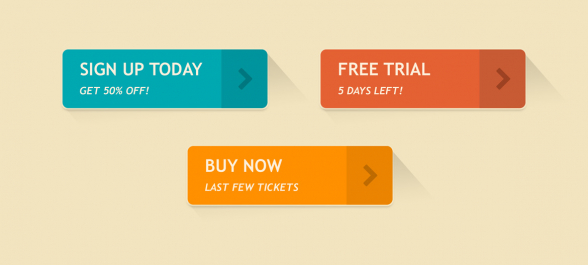
A good idea is to Make the offer available for a limited time only. This way you motivate a more immediate response. Even just adding “now” in your copy builds a subtle sense of urgency.
Here a couple of examples:
- Sign Up Today and Get 50% Off!
- The Ultimate Email Design Webinar – Register Now!
8. Play with Color and Contrast
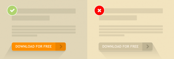
Design your call to action in a contrasting color to the background to draw more attention to it. The smaller the button, the sharper the contrast should be.
Also, consider how well the call to action color fits the color scheme of your HTML email. Use Adobe Kuler to find the complementary color to your background color. The high contrast of complementary colors creates a vibrant look especially when used at full saturation.
To measure the result use the good old “squint test”. Put together your email template, take a few steps back, squint your eyes, and see if your button stands out.
9. Keep Your Calls to Action to a Minimum
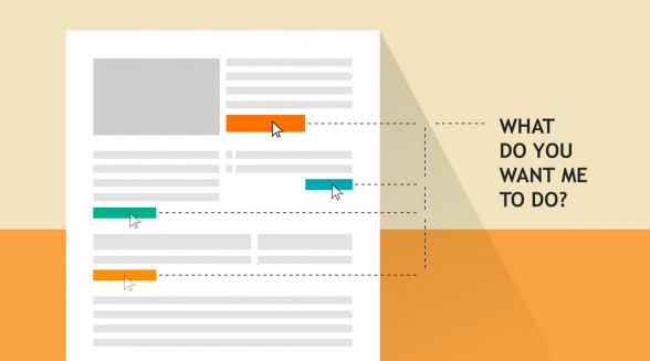
Make it easy on your customers by creating one primary call to action per email. People need to make decisions all day long, so adding another one on their list may result in them not taking any action at all.
There should be just one main thing that you would like your email subscribers to do, therefore one primary call to action. The rest should be “in-case-you-have-the-time” links.
10. Incorporate Icons in the Call to Action
Including visual cues in your calls to action is proven to increase email conversion rates.
For example, adding a shopping cart icon to an “Add to Cart” button is both helpful and recognizable. In general, adding icons to both text links and buttons contributes to the user experience and encourages clicks.
11. Use Negative Space to Position Your Call to Action
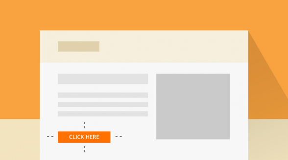
You want your call to action buttons to stand out from the surrounding email content and to really attract the readers’ attention.
Make sure to balance the size of the button with an appropriate amount of negative space surrounding it. This means putting some space between your content and your call to action button. Place other images or text further away from the call to action to give it much deserved individual attention.
Conclusion
An effective call to action is an essential part of a successful email template design. The more your calls to action are clear, to the point and designed to stand out, the better your chances of driving conversions.
Do you need help with your email template design? See what our design team can do for you – Email Templates From Scratch.

