21 Creative Examples of Illustration Graphics Used in Email Newsletter Designs
Reading Time: 5 minutesEmail newsletters are a great way for building your relationship with subscribers. If they’re interesting and creative enough, they will make subscribers come back to your website. This is why your email needs to capture the attention of the reader right away to avoid being deleted or never be read.
A good way to achieve that is to use visually appealing illustrations in your newsletter designs.
We have collected 21 creative examples of illustrations used in email newsletter designs, that will surely catch a customer’s attention and help the email message stand out from the competition.
1. The Misadventures of P.B. Winterbottom
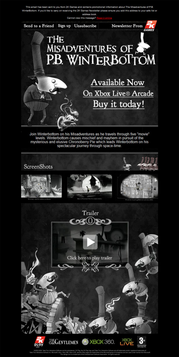
The Misadventures of P.B. Winterbottom is a puzzle platform game made for PC and Playstation. The email newsletter for the launch of the game definitely manages to pull you into the atmosphere and world of P.B. Winterbottom. With its black and white color scheme and beautiful illustrations of the main character, this email is very visually appealing and leaves a lasting impression.
2. Coach
Coach’s email newsletter is simple, clean, yet very beautiful and effective. They have combined solid, colorful images of their products with pencil sketches that act as backgrounds. This combination really gives the newsletter an elegant look and feel.
3. Tiffany & Co
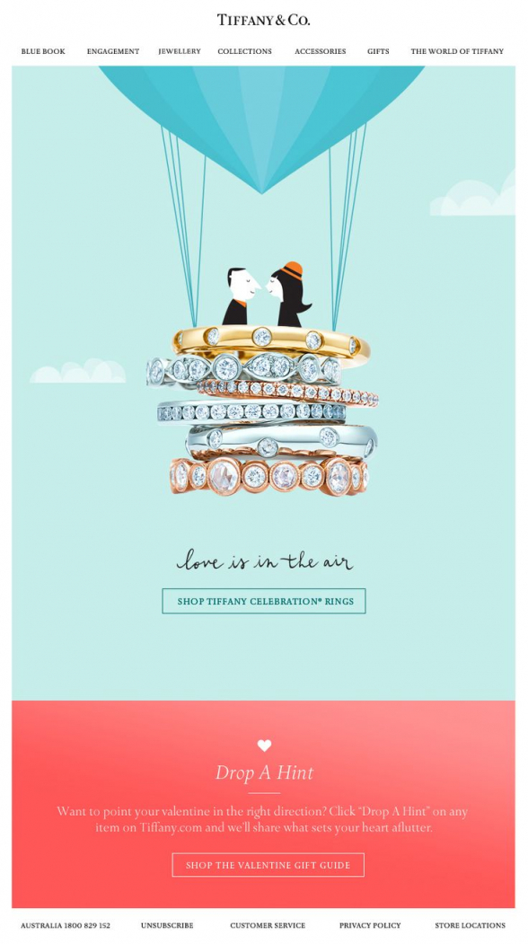
This Tiffany & Co creatively designed newsletter template is one of those templates that really grabs your attention at first glance. They have cleverly incorporated their products into the design along with a cute flat illustration of two people in love.
4. Facebook
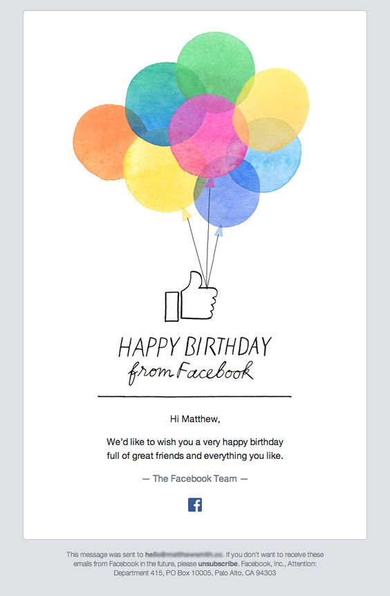
An illustrated birthday card from Facebook, probably most of you have already received one of these. Even if the Facebook logo is not there, you may still bet that it is coming from them, looking at the thumb up icon. The illustration resembles a watercolor painting and the white background makes these colorful balloons standout nicely.
5. Terrain
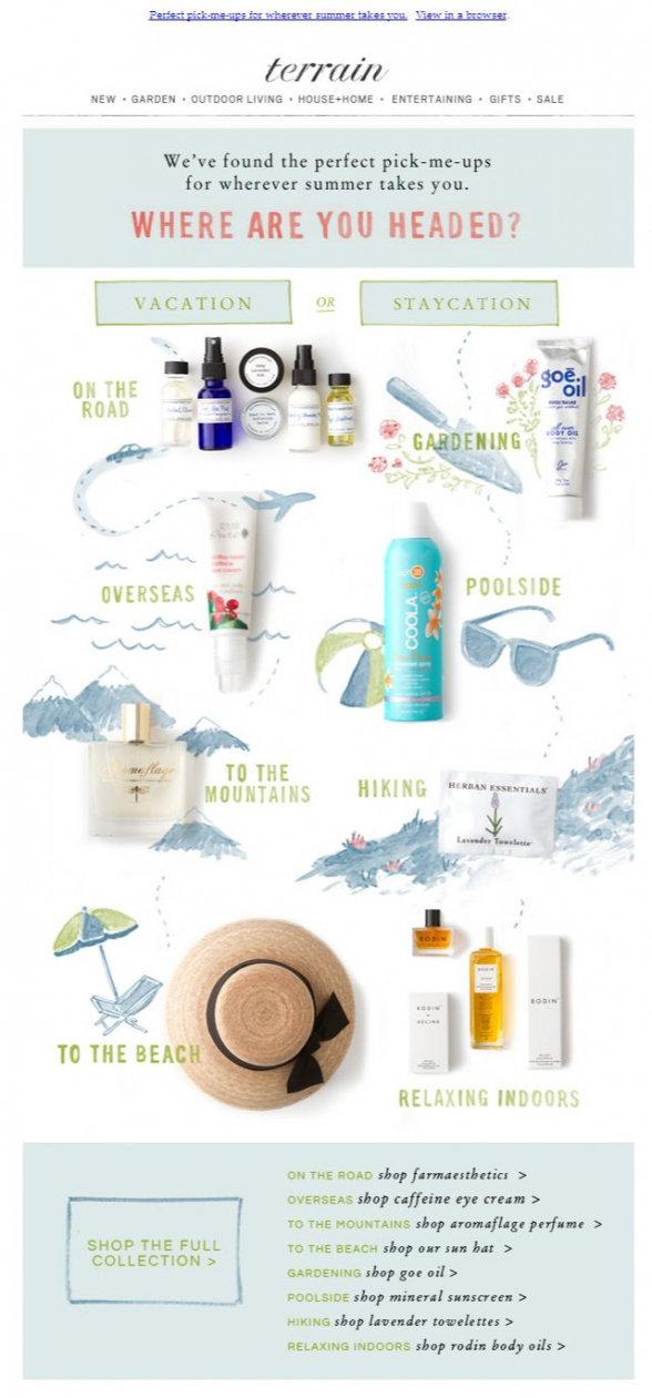
Terrain lists for you the perfect pick-me-ups for wherever summer takes you and present them in a cute way, sticking a quick illustration besides each item. All illustrations are in the same light blue color and create a very lovely feeling towards the composition.
6. Pattern Play
Another e-commerce email template that uses illustrations to depict the products on offer. This time the theme is very colorful with light blue background which makes the nice, big illustrations pop out. The template features a top navigation linking to the website pages and a footer with contacts and social media links.
7. Fitbit – Stay fit!
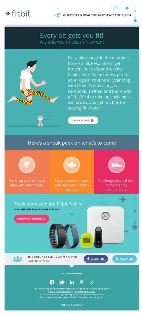
Here is a colorful email template with funny illustrations from Fitbit, the San Francisco based wearable gadgets manufacturer. This pajama-wearing, air-guitar-playing guy is so funny, with the cat staring at him, that you simply have to scroll down and see what the email has to offer.
8. Urban Outfitters
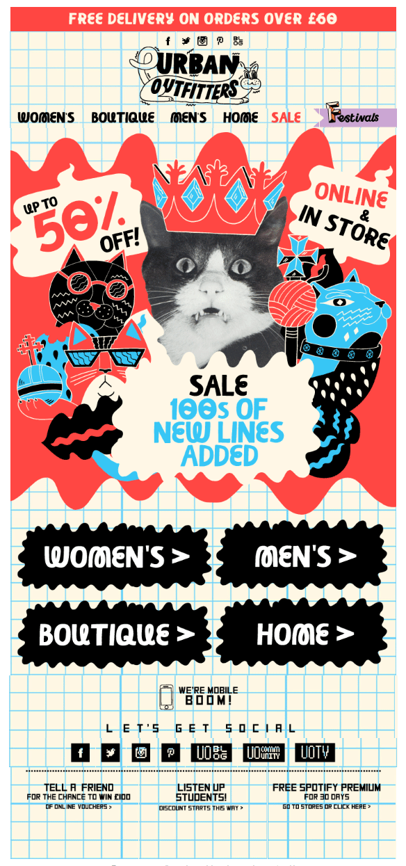
That is a weird one, but it definitely goes well with the Urban Outfitters’ brand. Not sure if that cat looks more scared than scary, but the illustrations around it are pretty abstract and even a little dark. The Sale bubbles and the links to the product categories is what gets you back to reality.
9. J. Crew – Say Hi to William
Here is a cute one from the US retail giant J. Crew. This one proves the idea that even a little touch from an illustrator may make a big difference. All you need is a photo of a white mice, with a winter hat, scarf and a pair of gloves drawn on it. White mice are kind of cute anyway, but add a pair of garment on it and you have a winner. This little fellah even looks like smiling, is not he?
10. Christmas Dinner
This is a beautiful one. Very creative. The theme is dear to all of us – the Christmas dinner – and the illustrations give so much life to the design of this template. You may put a navigation bar on the top and the contacts section in the footer and you ready to go. What a crafty combination of delicious looking dishes and smart hand drawings.
11. Pajama Collection
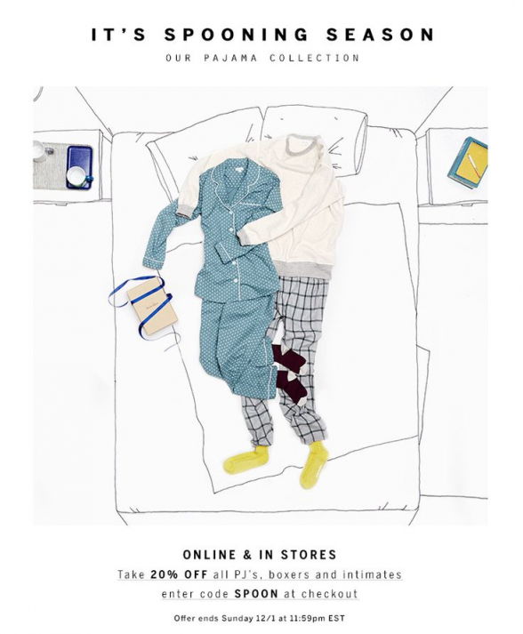
It’s spooning season again and this email template is another great example of how a simple, black and white illustration might be enough to create an original design. Just put a link to your
website and your contacts underneath and you are good to go.
12. Sephora – Illustrating Colors
Here is a nice, neat way to show your product’s colors, if you are a cosmetics retailer, like Sephora. They put together photos of actual products – lipsticks, makeups, nail polishes – and mixed them with illustrations of women’s faces and hands wearing the colors of these products. The illustrations being sketches in black and white, make the products’ colors stand out.
13. Jack Spade
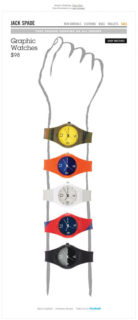
Graphic Watches in all color variations and what a funny way to introduce the new collection. Jack Spade used an illustration to do this and a very subtle one. No sophisticated graphics or colors are used, so the products may stand out and shine.
14. Happy Thanksgiving
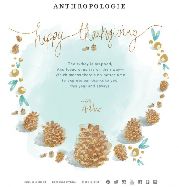
Here is a Thanksgiving email resembling a watercolor painting. The colors used are pale and the whole composition is very light. There are links to the website at the bottom and a social media menu.
15. Crusoe
Crusoe, the Indian men’s underwaear manufacturer, came with a very creative way of displaying their product. The boxers are placed in the middle of the image, surrounded by a beautiful illustration of algae, fish and other sea creatures.
16. Charity: Water
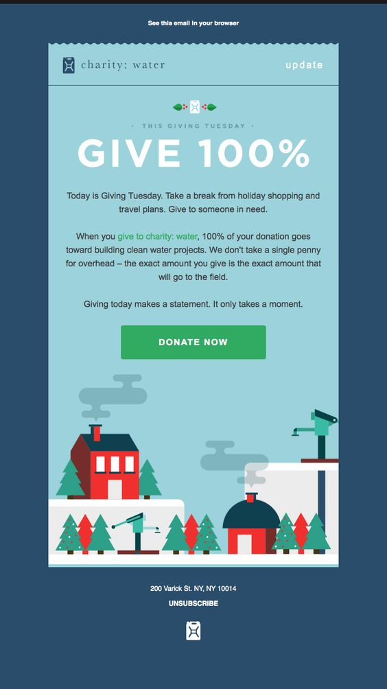
Charity Water, the non-profit organization that provides clean and safe drinking water to people in developing nations, reminds its subscribers for their cause with an email featuring a very nice illustration. The illustration is very childish and the different parts look like made of lego bricks. This one shows that you don’t need to be too serious with the design for your marketing campaign, even if your cause is that serious. It is more about winning subscribers’ sympathy.
17. Free People
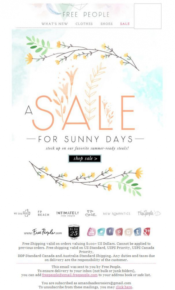
Free People, the American bohemian apparel and lifestyle retail company selling women’s clothing, accessories and shoes, is presenting their favorite summer-ready steals in an email featuring fresh and beautiful summer illustrations. The little flowers and the bits of a blue sky, gives it a very summery feeling.
18. Boden
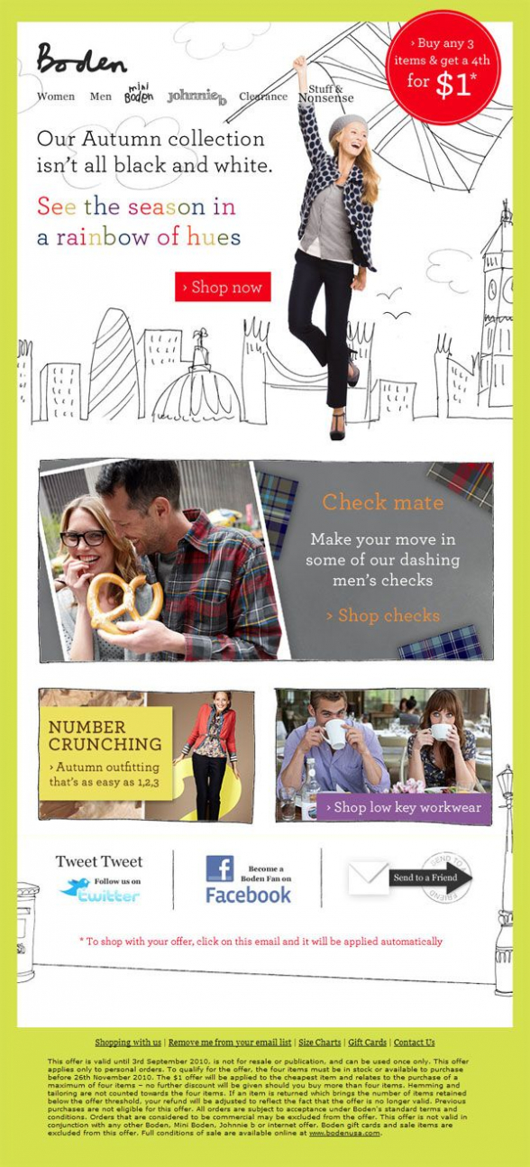
Boden combines hand-drawn sketches with real photographed images in this creative email newsletter. They have made the background of one of the sections entirely out of sketches, which makes the picture of the girl really stand out along with the call to action.
19. Find the Gift
Still searching for that perfect present? Simply, scroll down. This email template is a single illustration, smartly displaying the time you need to spend and the walk you have to walk in order to find the perfect gift. Use these guys’ gift finder and you will save a lot of time and hassle with the holiday shopping.
20. Seedcorn Competition
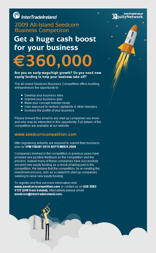
Seedcorn Competition’s email newsletter is made up entirely out of illustrations. They also rely on the dark color scheme for background contrasting with colorful images to really make them pop.
21. Mini Boden
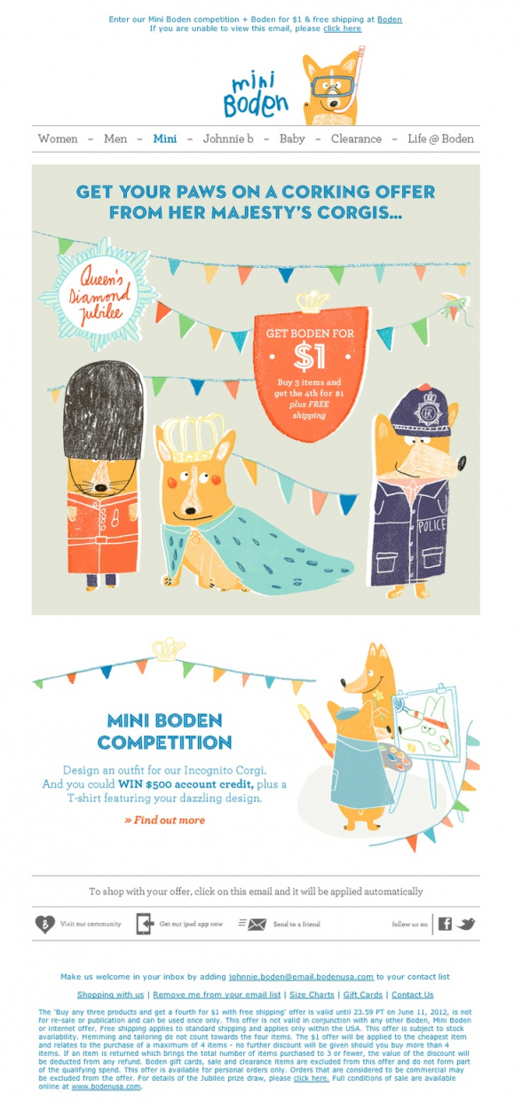
The UK clothing retailer Boden, sent this email to all Mini Boden fans. It shows a funny illustration of Queen’s corgis and invites its little friends to enter a competition for designing an outfit for Mini Boden’s Incognito Corgi. The illustrations are pretty childish and go wonderful with the email’s theme.
Conclusion
As you see, using illustrations in your emails may make them much more interesting and leave a long-lasting impression with your readers. Simply come up with a rough idea, discuss it with an illustrator or designer and create something unique.
Need some more inspiration? Check out some actual email templates we have designed and coded for our clients on our Samples section.

