22 Excellent eCommerce Email Templates Examples to Inspire Your Next Campaign
Reading Time: 5 minutesThis article was last updated on September 1, 2020
In this day and age of social media takeover, having an eye-catching and informative email newsletter is vital for any company – big or small.
Why use ecommerce email templates?
Ecommerce email templates are cost effective, they increase brand awareness and they can be very easy to edit and use.
We have collected 22 excellent ecommerce email templates examples that will surely inspire your next campaign to stand out from the crowd.
1. Perfect Timing
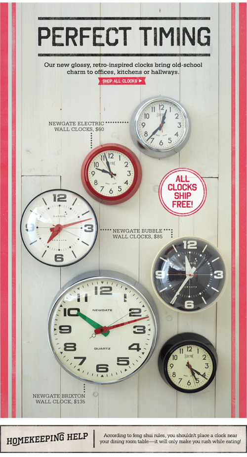
This eCommerce template is not your typical newsletter, It’s clean, clear, straight to the point. It does a great job of showcasing the clocks this store seems to be offering, along with their names, prices and a bright call to action button.
2. Animal Farm
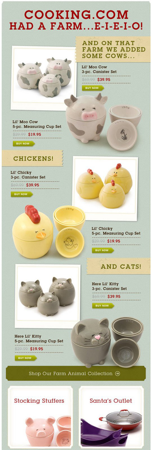
This newsletter is also unusual, but effective nonetheless. It showcases little measuring cups in the form of adorable farm animals, which of course explains the witty titles. The big images really focus the subscriber’s attention on the product itself and the green Buy Now buttons.
3. Lomogrpahy
Lomography’s email newsletter is very clean and clear and pretty much lets the vibrant colors do all the “talking”. The red, blue and green cameras really stand out and capture the subscriber’s attention. They have also added some nice carousels of pretty images in the form of a film tape.
4. Apple
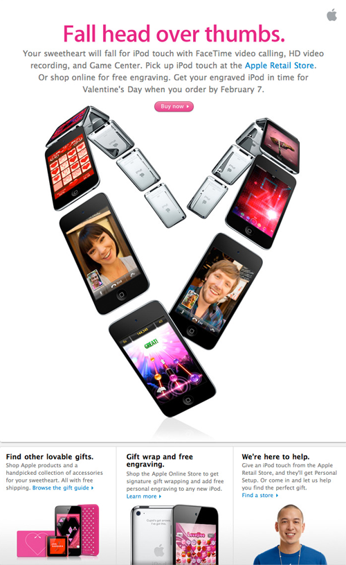
This newsletter brings imaginative use of beautiful graphics into play along with many iPhones that are placed in the shape of a heart in order to embody the love that we all have for the device.
5. Ben Sherman
This Ben Sherman newsletter really shows off each of their knitwear category with interesting image placeholder shapes and a little information about them.
6. Espirit
Espirit’s newsletter for their Recycled Collection does a good job in showcasing the clothes they are offering along with a model wearing them. Each of them even has their own call to action, so if you like one piece of the outfit you can just click to find out more about it.
7. FiftyThree
FiftyThree’s sells custom printed books and covers and their newsletter design uses warm yellow and grey colors. This in turn helps all the books and other products stand out and it also has a bright call to action to capture attention.
8. JCP
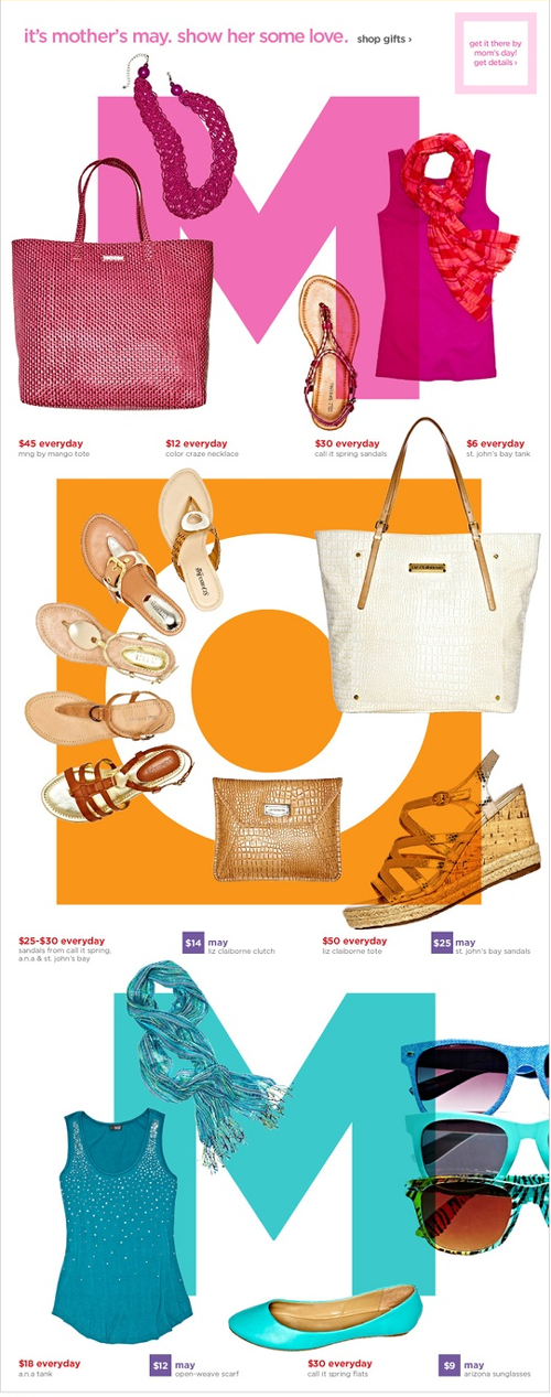
JCP’s special mother’s day newsletter uses typography and vibrant colors to really stand out and catch the eye of subscribers. They have spelled out the word “mom” in different colors and on each letter there are products such as tank tops, shoes and accessories matching that theme.
9. Verizon
Verizon has added in their newsletter, not only the products they are selling, but also a table of reviews from satisfied customers. They include useful information about the product specifications such as sound quality, comfort, durability, value and an overall rating.
10. Canon
Canon’s newsletter is very clean and uses bright colors such as red for the text and green for the call to actions, to make them stand out more. Then we have each product either on the left side of the newsletter or the right. Simple, clear and informative.
11. Coach
For Red Letter Day, Coach styled their email newsletter according to that particular color scheme, of course. They have showcased some of their products in red on white and grey backgrounds, which really makes them stand out. They’ve also added some rose petals all over the template which makes it look like they’re falling, giving the newsletter a very creative look.
12. Free People
With this newsletter, the boutique Free People is advertising their newest store app with the headline “Your favorite boutique…in your pocket”. They have used pictures of people’s hands holding iPhones as a way to showcase the interface and features of the app.
13. Sephora
What’s interesting about this newsletter is the use of typography. From the headline “High IQ” which contains an image of a model inside of the letter Q, to all the product placeholders that are also in the form of the letter Q. This certainly makes the newsletter quite memorable.
14. Corbis
Corbis’ newsletter design is very clean and clear in a white and blue color scheme. They have also included various categories in the beginning of the newsletter that act as a map legend of sorts. They have done this, because each article in the newsletter seems to belong to a different category. This helps the readers distinguish between them.
15. Motor Cycle
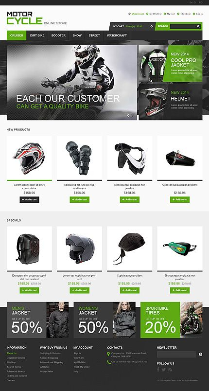
This newsletter design for Motor Cycle is also very clean and clear. It uses the logo’s main colors as it’s scheme. The use of the green really makes the content and call to actions stand out and give it a fresh look and feel, which attracts the subscriber’s eye.
16. Urban Sneakers
Urban Sneakers uses a pretty unique and unconventional design for their newsletter. They may not have included much information about the products, but the images in which the sneakers are highlighted, clearly catch the reader’s eye.
17. Ruche
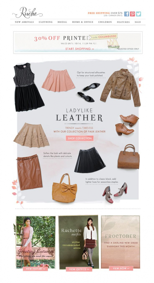
Ruche’s newsletter design is very elegant and they have showcased some of their collection such as jackets tank tops, dresses, handbags, shoes, etc front and center. It shows just enough to get you interested in clicking that Shop Collection button to find out more about it on their website.
18. Astley Clarke
Astley Clarke is a boutique in London that sells all kinds of jewelry and they have chosen the color scheme of their newsletter to be white and gold. This scheme helps the products and call to actions stand out more and catch the subscriber’s attention .They have also spelled out the word “SALE” in a very creative way using tiny gold butterflies.
19. Lot 18
Lot 18 offers exclusive access to the finest wines and artisanal selections. Their newsletter uses an orange and red color scheme to make the images of the wines and other products, along with the call to actions stand out.
20. Williams-Sonoma
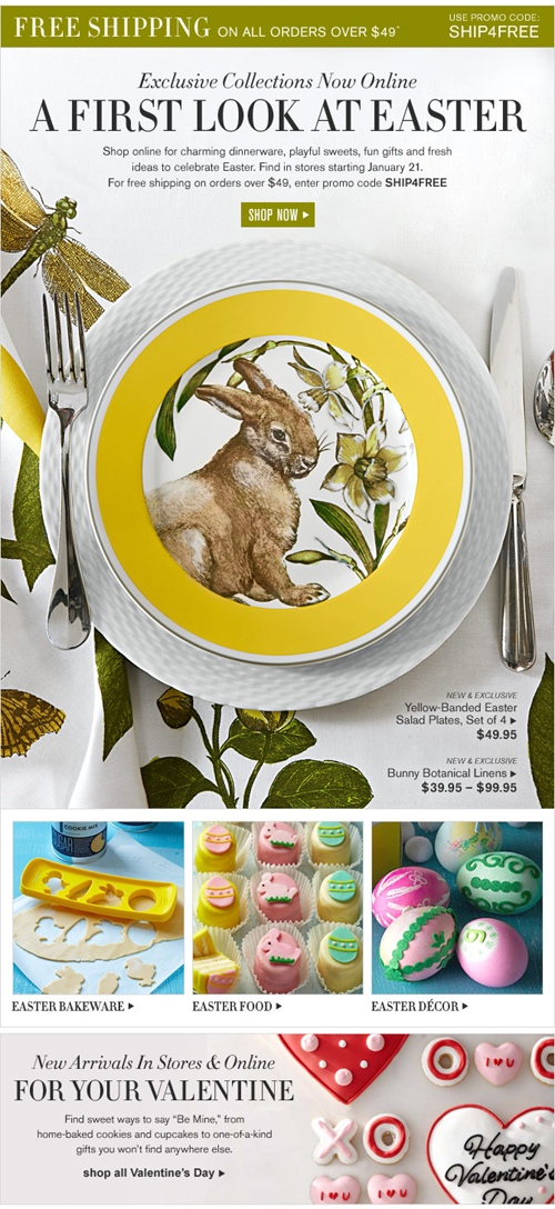
Williams-Sonoma’s newsletter for their Easter collections of charming dinnerware, playful sweets, fun gifts and ideas for the holiday focuses mainly on the images of the products. It doesn’t have a lot of text, but doesn’t really need it either. This is another instance of having just enough information to get the reader interested in finding out more in their website.
21. Miche Bag
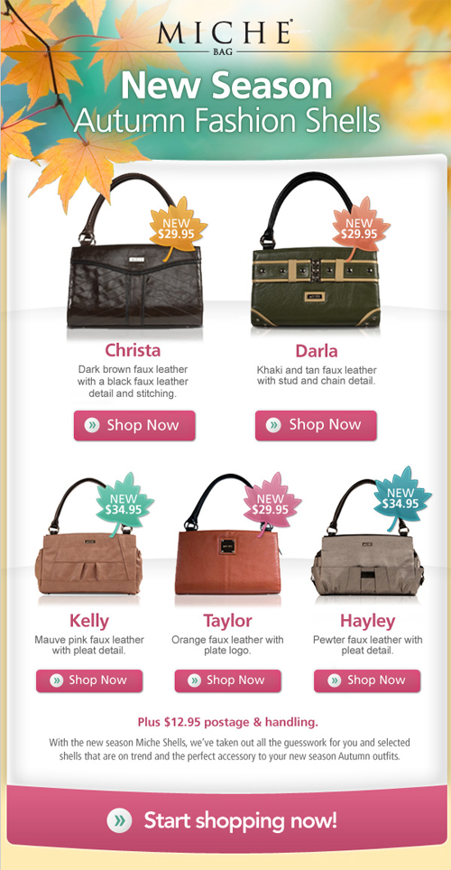
This is a well suited template design for a newsletter that offers exciting deals about handbags. The design has a very autumn look and feel thanks to the colors and multiple leafs all over the template.
22. Target
This Target email newsletter has both primary and secondary CTAs that allows subscribers to shop by age and product categories within those age brackets. They have used vibrant colors for these CTAs and other text in order to make them stand out more.
Conclusion
Ecommerce newsletters are a versatile and inexpensive way to reach your audience over and over again. Their job is to catch the reader’s attention with the help of bright and vibrant images and call to actions. All the while, giving them just the right amount of information to make them want to check out the store website for more.
Feel like you need some more design inspiration? Check out the sequel of this post – 27 Awesome eCommerce Email Template Examples to Inspire Your Email Designs.
Do you need help with the design or coding of your ecommerce emails? See what MailBakery can do for you – HTML Emails from Scratch.

