26 Frightfully Fun Halloween Email Examples: Inspiration for Halloween Email Campaigns
Reading Time: 8 minutesHalloween is upon us! And email marketing and Halloween are like a match made in the spirit realm. It’s one of the few times of year that companies get to unleash their creativity and find innovative ways to express themselves and garner engagement from subscribers.
It’s a family-friendly holiday that’s unlike Thanksgiving and Christmas. Because treats and costumes drive the revenue for this holiday, marketers can tap into a new target audience with significant results.
Below, we’ve compiled a list of our favorite frightfully delightful marketing emails to get you in a spooky mood.
1. Starbucks
Spooky designs don’t always have to be intimidating. With the use of chalk illustrations, Starbucks creates a haunting, foggy scene. Throughout the email, the pops of color create an ominous glow draws attention to those new terrifyingly delicious Halloween-themed treats on their menu.

2. Modcloth
Modcloth uses silhouettes and playful phrasing, which are a treat on their own. The email also highlights the newest pieces to their fall/Halloween collection. Each panel features a bewitching way that you can dress using their apparel.

3. Paper Source
Stationery and gift brand Paper Source is known for its cards, crafts, and novelties. So, it’s only natural that their Halloween-themed emails would feature paper spiders. The dancing spiders’ animation directs subscribers down the email, where different colors punctuate more festivities like fall giveaways and workshops. Each section has a call to action button, each instructing the reader to participate in different ways.

4. Airbnb
Airbnb is the king of vacation rentals, and haunted houses are a staple of Halloween. Put them together and what do you get? One frightful and intriguing marketing email. The use of ominous lights sets the mood, encouraging the reader to scroll down and check out listings of haunted houses and eerie estates that are sure to thrill.

5. Case-Mate
In case you forgot about what a spooky world we’re currently living in, phone accessory brand Case-Mate has got you covered — literally. This email uses festive Halloween colors to usher in the holiday and animations of ghoulish smiles to highlight its new Halloween-themed face masks.

6. Dunkin’ Donuts
Dunkin’ Donuts used a “choose your own adventure” style element in this design, similar to popular YA novels so many kids love. And we’re fans. Who doesn’t love the option to choose which decadent treat they can enjoy while racking up points for future use!

7. Clinique
One of our favorite things about Halloween is the ability to transform into someone else, if only for one night. Long-standing cosmetics brand Clinique pairs this idea with the popular email marketing tactic of showing readers how to do something. In this case, it’s how to create a “ghoulishly glamorous” Halloween look. The email even invites you to try the look yourself and shows you which products you need to achieve it.

8. Crate & Barrel
Halloween isn’t just a holiday for kids; adults can have some fun, too. Crate & Barrel’s email invites subscribers to imagine a spooky soiree with friends and reminds them that they’ve got all the tools for a good time.

9. Lands’ End
For retailers, folding clothes to create an image is an impressive and fun way to grab the reader’s attention. Lands’ End casts a spell with its rhyming words and the use of larger text to drive home the point that readers shouldn’t miss out on these savings.

10. Mango
Sometimes a great design doesn’t have to be a complicated one. Spanish clothing designer Mango captures how we all, kids included, love to play dress up for Halloween through a sophisticated yet straightforward overlaid sketch.

11. Milani Cosmetics
Gifs are always a popular design element in email marketing. When used correctly, it’s incredibly effective. Here, Milani Cosmetics conjures up a spellbinding limited deal for all who purchase products: liquid lipsticks from their Halloween collection. By using imagery and a smoky effect, subscribers are hypnotized into clicking the call to action button.

12. Lush
The supernatural is the theme of this Halloween-inspired design. Many of Lush’s products bubble like a potion in a cauldron. The California-based brand used this as the focal point of their email. However, they stuck to their branding format of showcasing their new seasonal additions, complete with playful descriptions.

13. World Market
There’s nothing like décor to set the stage for an eerie good time. Each panel has a stylish fall-themed scene for every enthusiast, from macabre Halloween and vintage flair to traditional fall fare. This simple design appeals to different customers in a personalized way.

14. Clear
Telling scary stories by candlelight can be pretty spooky. So can airport lines. Clear, a company that helps you quickly and securely move through airport security, offers escape from this scary experience with a free 2-month trial of the services. Appealing to a customer’s pain point is part of email marketing 101, and Clear does it flawlessly!

15. Blue Apron
An excellent tactic for getting former customers to come back is with a deal, and in this case, it’s one to die for. Not only does the language play into how your regret of not clicking that call to action button will haunt you, but the cookie tombstone cupcakes are also an irresistible touch. Sign us up!

16. Emma
Even though this email isn’t particularly spooky in its design, it’s the word choice that sparks fear in readers. What’s creepier than your spam folder?! It’s where all sorts of horrible things live. With its simple design that appeals to those who celebrate Halloween and those who don’t, Emma chills readers to the bone.

17. Fortnum & Mason
Plays on words are always a delightful way to grab the attention of readers. Fortnum & Mason plays on the spooky song “The Freaks Come Out at Night” and adds a silhouette of a hungry beast on a moonlit prowl (psst: that’s you searching for treats in the wee hours of the night).

18. Harry’s Grooming
Harry’s hair-raising how-to email uses classic horror characters to highlight their products and demonstrate what they can do for the customer. Although it’s a clean and minimalistic design, it’s the words that shine; comforting the subscriber with a witty dialog that leads them straight to the “redeem trial button.”

19. DogVacay
The only thing cuter than kiddos in costumes is, of course, puppies in costumes. It’s a reminder to the reader that your pooch might want to participate in some Halloween fun, too. And if you’re scrambling for a last-minute costume idea, they’ve got a few examples for inspiration.

20. Kohl’s
Our favorite design element is the use of candy apples to show how much 40 percent off is and how sweet a deal the retail store offers. The image, paired with a traditional orange background, allows the template to be used for Halloween and throughout the fall.

21. Whistlefish
Crudely drawn illustrations and mismatched fonts are an excellent way to create an email that looks hand-drawn. Whistlefish also creates mischief through the use of a trick or treat mystery coupon. Curious customers put in a secret code at checkout to determine if they’ve been tricked or if the discount is sweet. It’s a surefire way to drive customers to your site!

22. Lumosity
An email doesn’t have to be creepy to get a reader’s attention. Sometimes they can be adorable. Lumosity’s mascot is an owl, as they represent wisdom, and in this darling email, costume-clad owls offer you a sweet deal to treat your brain to their services.

23. Taco Bell
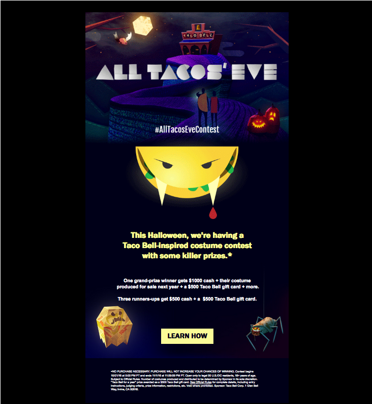
Another strategy to earn reader engagement is a contest. Taco Bell uses the idea that hunger turns us all into monsters to announce an “All Tacos Eve” costume contest. Participants are encouraged to submit photos of themselves in Taco Bell-inspired costumes to win killer prizes. We’re also a fan of the use of food as creatures.

24. Williams Sonoma
Let’s face it; there’s no Halloween without the treats! Williams-Sonoma shows you all the ways your Halloween bash can be a blast. By putting all their devilishly delightfully treat offerings on display, you kickstart the reader’s imagination and interest in hosting an event.

25. J. Crew
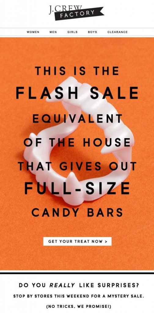
Simple, to the point, this design plays on readers’ fear of missing out (FOMO) by letting them know just how big their flash sale is and why they don’t want to miss it. We love this idea because it taps into our memories of what it’s like to score a full-size candy bar while trick-or-treating.

26. Tattly
Monsters might be living under your sofa, but don’t worry, they’re friendly! The temporary tattoo-clad hand creeping up from underneath the darkness and fun language about monsters taking over the Tattly headquarters is a brilliant way to showcase their new tattoos by a guest illustrator.

MailBakery

We hope our collection of Spooktacular emails have got you interested in spinning your own ideas. Halloween is the perfect time to promote your business and drive traffic to your website, even if your product isn’t spooky.
If you’re interested in creating your own design, our team at MailBakery can create an HTML email template that’s brand-specific and hauntingly beautiful.
Contact us today, and let’s bake something fresh!
More on that:
- 35 Halloween Email Examples: Inspiration for Halloween Email Campaigns
- 25 Brilliant Email Marketing Campaign Examples From the Pros
- Email Design Inspiration: Top 10 Sources for Top Inspiration
- Email Marketing Inspiration: Summer 2018
- 6 Beautiful Email Designs You’ll Want To Copy For Your Next Campaign
