40 Email Template Sections To Inspire Your Future Designs
Reading Time: 5 minutesDesigning your email template might be a daunting task, especially if you are new to email marketing. More often than not, you are caught in a process of constant iterations and spend long hours working on an email design that should have been already completed… last week.
Now, to save you time and make your email marketing experience a bit more pleasant, we sliced into sections one of our own master templates for you.
Below you will find 40 email template sections (headers, newsletter sections, ecommerce sections, transactional email sections, footers, etc) which you could use for designing your own email templates.
You no longer need to peep into competitors’ marketing emails for “inspiration”. Just get the layouts you like most and hand them to your designer. Good luck!
1. Email Header 1
Here is a simple email header with links to main sections on your website and a line of social media icons in the top right corner. It also features a View Online link in the opposite corner.
2. Email Header 2
An even simpler version of email newsletter header. You have a logo, email send date, social buttons and a home page link.
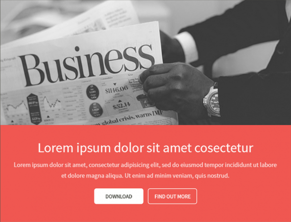
3. Hero Image, Intro and CTAs
This is the hero section for your email. It features a big image of your products, services or any other image your audience identifies your brand with. Then you have an email title and a short paragraph. The section closes with a couple of call to action buttons that may link to more information or a product purchase page.
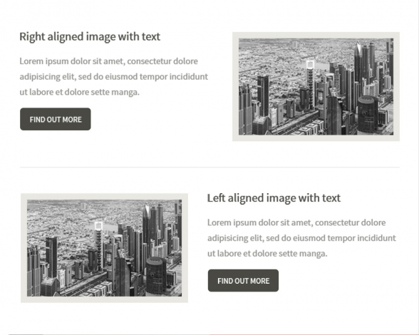
4. Short Previews with Images and CTAs
This is one way you could link information on your website from your email. A section title with some short text and a find out more button. You may place an image on either side of the text.
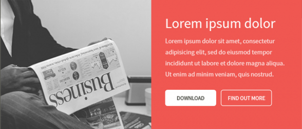
5. Full Height Image, Short Preview and CTAs
Here is another way to style a preview in your email that links to your website. A full height image with a contrast color backgound for the text and a couple of CTAs.
6. Three Icons, Texts and Titles in Portrait
Here is good way to list your service features for example. You have icons depicting each feature with text underneath. Place links behind the icons and titles for a better result.
7. Product Features Preview Section with CTA
That’s another way to show your product’s features. This email section takes a bit more space which allows it to stand out a bit more. There is a short description line on top and three service features icons underneath with a CTA.
8. Two Icons with Text Previews Placed Horizontally
Here is a horizontal layout for a couple of icons with text. You may link to a video presentation from here if you wish.
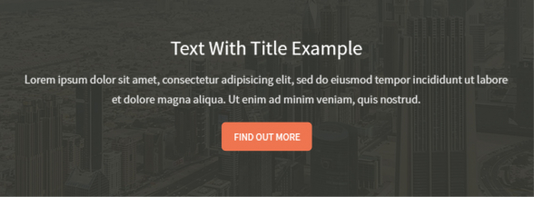
9. Image Background Preview Section
The background image is a very effective email design element. Many of the designs we receive for HTML coding feature background images. Bear in mind that they are not fully supported and some email clients still replace the image with a solid color.
10. Image Gallery Section
A simple image gallery with three images.
11. Image Gallery with Description
Gallery with three images and text underneath.
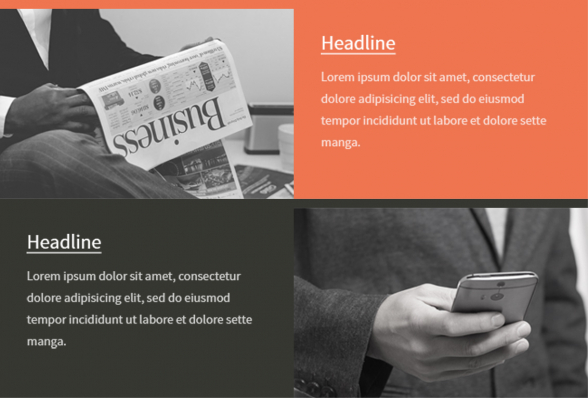
12. Text & Image Section in Checkerboard Layout
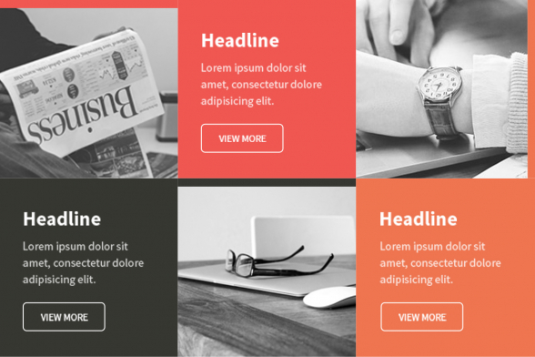
Beautiful checkerboard layout for blog posts previews in email. As text background use contrasting colors to the main background color of your email for a more attention grabbing effect.
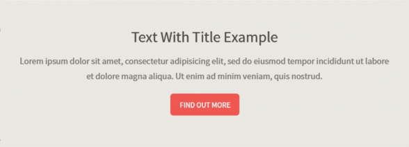
13. Solid Background Preview Section
A simple, centered text on solid background area. Use this email section with centered text to highlight a message.
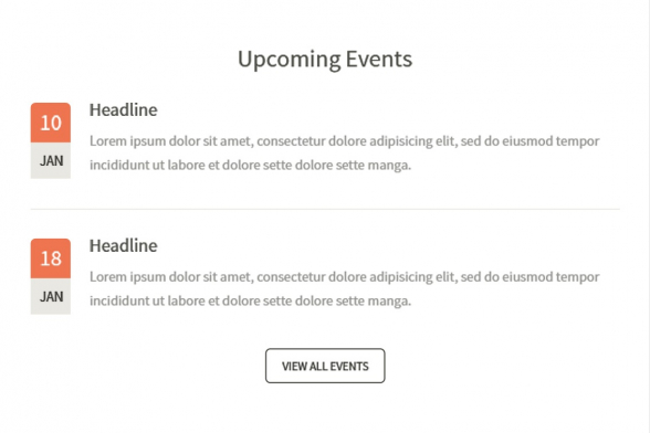
14. Upcoming Events Section
Should you attend any trade fairs, let your clients know when and where. This email section is taylor-made to announce your upcoming events.
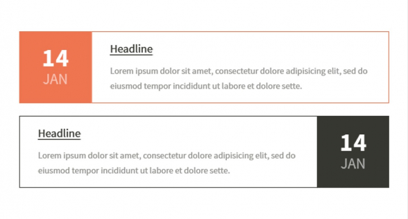
15. Roadshow Dates Section
Announce the upcoming dates of your roadshow with a design featuring bigger calendar dates.
16. Two Column Layout on Solid Background
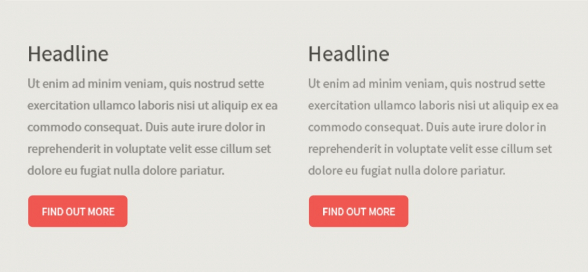
No images in this email section, but this allows you to fit a bit more text in the same space. The two buttons allow the reader to find out more on the topics.
17. Product Preview Columns with Prices
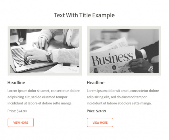
A nice, big email section for a couple of product reviews. Features images, prices and CTAs.
18. Testimonials Section
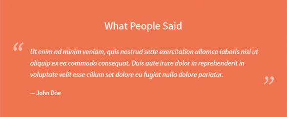
Big, clear testimonials section with quotation marks. Share with your email readers what your clients and partners think of your brand.
19. Testimonials Section with Images
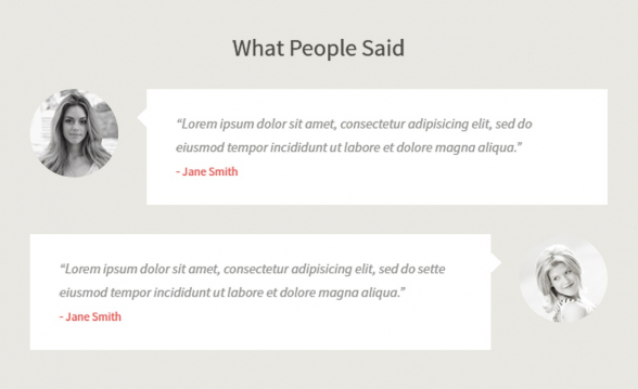
This testimonial section fits two reviews in. It also shows clients’ pictures, which adds to the authenticity of the testimonials.
20. Bullet List on Solid Background
You have a bullet list to share with your audience? Here is one way you could do this in email.
21. Portrait Image, Statistics & CTA
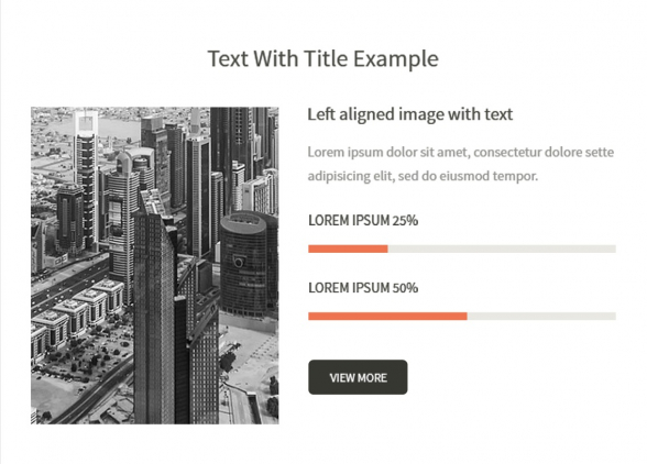
Here is how you could arrange an email section with an image in portrait. You may fit in some statisctics and a quick call to action too.
22. Checkerboard Product Preview 2 by 3
Here is a beautiful way to organize your email presentation in checkerboard layout. You may fit three images and three texts in a standard email width (600-700 pixels) and they will still read and look right.
23. About Us Section
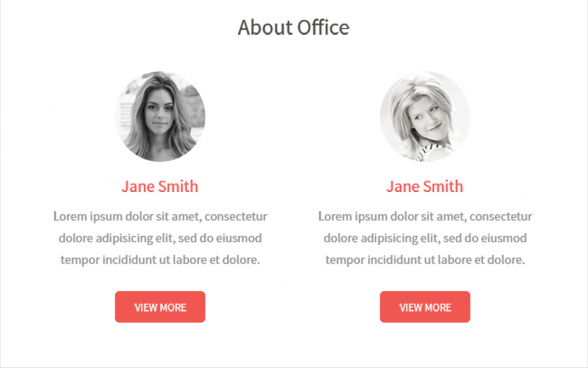
In case you want to show your team, here is one way you could do this in email.
24. Product Review, Prices and CTAs in Portrait
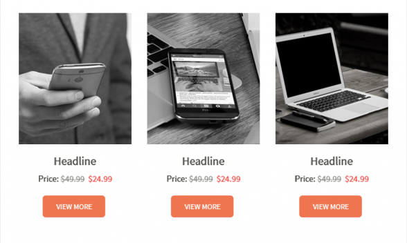
Neat product review layout in three columns. This email section features also short text, prices and call to action buttons.
25. Product Review, Rating and Price
If you wish to emphasise a product review, you may use a whole section for a single product review.
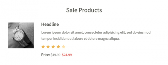
26. 2 Products Reviews, Ratings and Prices
Another product preview section this time with images, ratings and prices for a couple of products.
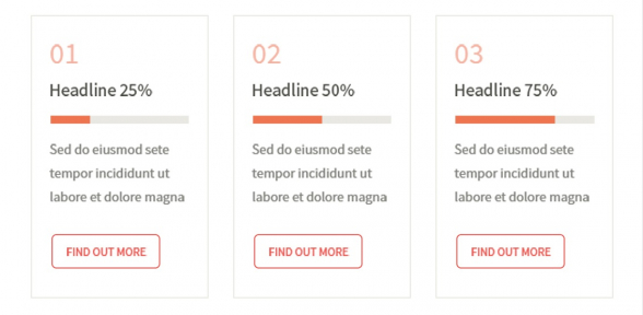
27. Text Only Review Section in Portrait
A neat portrait section with no images, but some space for statistics.
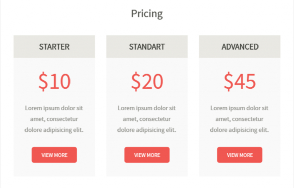
28. Pricing Options Section
A pricing section in portrait layout. Show your pricing plans and let you readers find out more on your website via the buttons at the bottom.
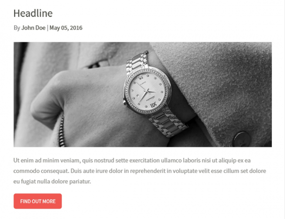
29. Newsletter Article Preview
This newsletter section, allows you to give a good preview of your latest blog post. The section features writer’s name, date the post was published on and big, sharp header image.
30. Recent Articles Section with Links
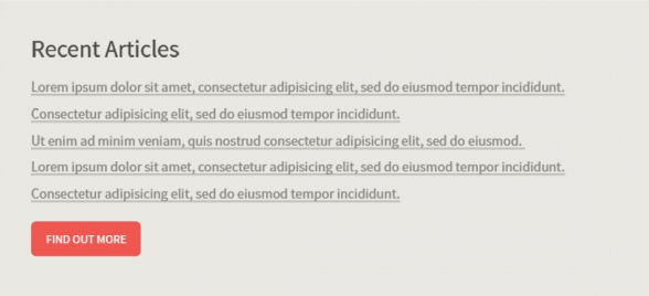
Here is a section to list your most recent articles. Link them from your email, so you readers could access your blog directly from their inbox.
31. Image Gallery
A 2 by 3 image gallery layout. It looks a little like carousel and with the new interactive email techniques it could be made as carousel. More on Interactive Email Design.
32. Order Confirmation
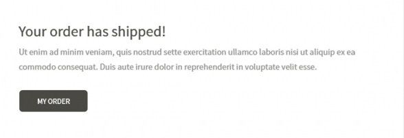
Here is how an order confirmation email could look like. Throw in your logo and style it in your brand colors and it is ready to go.
33. Expected Delivery
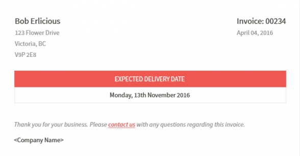
If you are shipping psychical products to clients, this is how you could let them know when to expect their shipment.
34. Purchase Details, Quantity & Pricing
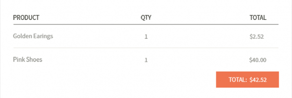
If you are shipping more than one product to your clients and you wish to inform them about some more shipment details, this is a neat layout you could go with.
35. Cold Lead Activation
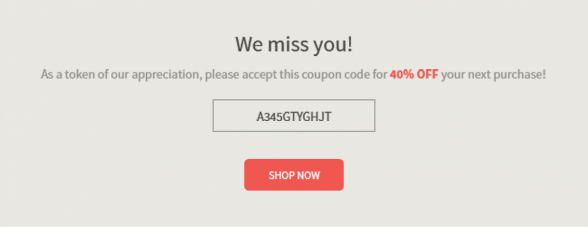
This one is to go out to those of your clients who have not been active for a while. Send them a short email to say that you miss them and offer something little to show that you really care.
36. Account Set Up, User Invitation
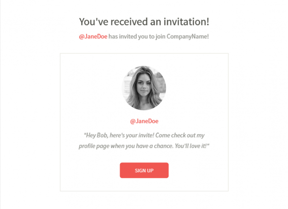
If you have a client system, which automatically creates accounts for your clients this is how you could inform them about the created account and invite them to log in.
37. Table Section
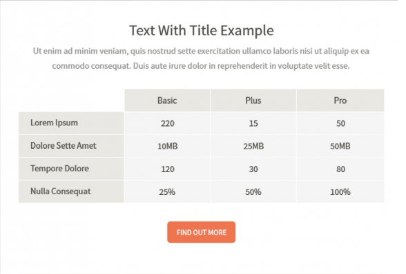
If you have to list some information in a table format, this is one possible email layout.
38. Contact Us
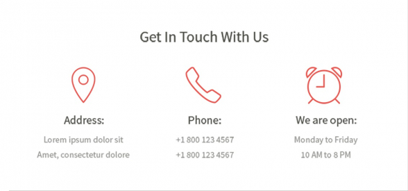
Contact section to share your address, phone number and working hours.
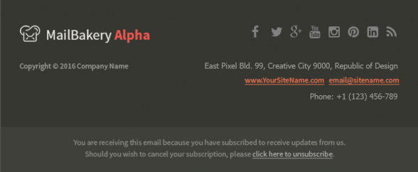
39. Email Footer 1
This footer section features company logo, social media bar, your contacts and the unsubscribe paragraph.
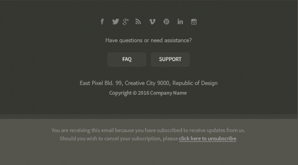
40. Email Footer 2
Another footer version. This one displays the text centered and featurs a couple of buttons to your FAQ and Support pages.
Conclusion
Email design is very important for how our email campaigns perform. It has to be modern and catchy, but also to stand out and represent your brand. We hope that the above email sections list really helped your email design efforts.
If you still feel like you need some further assistance with your email design, you may take a look at what MailBakery can do for you here Email Template From Scratch.


