8 Tips To Creating Visually Appealing Emails
Reading Time: 6 minutesEmail marketing is one of the most successful ways to generate new leads and convert customers in the marketing business. However, getting customers to spend the time reading them is a challenge. The average person spends between 11 and 15 seconds reading an email, which means you have mere moments to capture your reader’s attention. And how do you do that? By creating visually appealing emails. Here are a few things to consider if you want to grab the attention of your reader.
Hot Links In This Article:
1. Think About Layout

The layout of an HTML email is critical. It’s where your readers direct their focus. You can also use layout design to guide your reader’s eye to the information you want them to see first. A study by the Nielsen Norman Group revealed that people tend to read in an F pattern, moving from left to right, and focusing heavily on the first few lines they read.
The same study also found that people skim the rest of the content they read. Looking for keywords, and picking up bits of information rather than reading everything on the page. Take this into account when crafting visually appealing emails. A best practice is to keep your HTML email layouts within 350px (pixels) in height and 650px (pixels) wide. Anything larger than that and you run the risk of your content getting lost and unread. Plus, having too wide of a layout results in needing to scroll from side to side. Doing so requires extra effort and can make the email appear ill-formatted, or worse, like your company is inexperienced.
2. Above the Fold

Keep your content above the fold. It’s an often-used strategy in print journalism where, you want to keep essential information front, center, and above the fold of the newspaper. It’s the space most readers consult before deciding if they’re going to buy the paper. And according to an expert study on eye tracking, it’s also where 80 percent of internet users spend their time reading.
This concept applies to email marketing, too. Here, the fold on the newspaper gets replaced with the content visible to the reader without them having to scroll to view it. It’s the vital information your customer uses to decide whether they will continue to read or click the call to action button and visit your site.
To have a visually appealing email, you also have to consider the content your customer reads as soon as they click on your email. To borrow another journalism tactic, use a reverse pyramid for displaying your content. You have mere seconds to capture and keep your customer’s attention, so make sure to strategically place crucial information at the top of the page, enticing them to learn more.
3. Speak with Color

The use of color can be a powerful tool when creating visually appealing emails that convert. Each color has an association and can be used to drive home a message, convey a feeling, or a mood. For example, the color purple often suggests creativity, wisdom, and imagination, whereas green is often associated with the environment, peace, or health. When relating to seasons, use colors that are appropriate for each season. Bright colors and soft pastels usually evoke the feeling of summer.
You can also use a pop color to give your design flair if there’s too much white space or use what’s called color blocking to break up information or draw attention to exclusive info. When thinking about which colors to use, we always recommend starting with colors that are on-brand or complementary to the ones used in your logo. If you’re creating a color pallet, try analogous colors, or a triad of colors.
4. Keep it Simple

In the same vein as using color, a lack of color can be powerful, too. The less is more approach allows for whitespace to give your designs a polished, yet minimalistic look. It creates a visually appealing email and puts more focus on your content and makes things easier to follow for customers. It’s tempting to jam-pack your emails with info, but keeping it simple and highlighting vital information is a winner. And added design tip is to pair patterns with the whitespace. This is achieved with product placement or simple accents.
5. Use Web Safe Fonts

Although web-embeddable fonts allow companies to be creative and stand out, it can cause issues in your email marketing campaigns. Such problems include affecting rendering speed, formatting issues on mobile, or fonts not displaying correctly if at all should the font’s hosting site go down. Hiccups in your code cause your emails to be less appealing and lose that much sought-after engagement. It’s best to stick with tried and true fonts like Times New Roman, Arial, Verdana, and Georgia.
6. Have Strong Imagery

A picture is worth a thousand words, and in email marketing, that translates to an impactful few seconds. That’s how long you have to capture the interest of your customer. Studies have shown that people are more likely to look at and react to the strong image you feature than the words you write, even if they contain valuable information. Since we are such visual creatures, a clear way to make visually appealing emails is to incorporate images that do one of three things:
- Evoke emotion
- Make them relate
- Make them want to engage in an activity
Images are also a great way to enhance the quality of your emails and create creating visually appealing emails. A thing to keep in mind when using imagery is that email clients block images for various reasons. This can pose problems if you write content on images. The only way to combat this is for the customer to opt into viewing images within the email. To increase the chances of your images getting seen, include alt text for your pictures and use descriptive wording that piques the reader’s interest.
7. Experiment with Animation

We’re all familiar with adding images to emails, but adding animation is another way to enhance your emails while engaging your customers more. Animations command your reader’s attention and, based on its contents, increase your click-through rate. You can create animations with the help of Adobe Photoshop or Canva, but creating an animation frame by frame can be time-consuming. So, opt for the internet’s second favorite form of expression: GIFs. Using pre-made GIFs are a way to show creativity and make your company appear relatable.
8. Call to Action

Included in every visually appealing email is a call to action button. So, when you’re creating visually appealing emails, make sure they stand out and make your customers want to click on them. Add pops of color and be witty with the phrases that appear on your call to action button. A few useful phrases are “reveal offer,” “try for free,” and “discover more.” It’s also important to find a balance with your call to action buttons. Because your emails will be viewed on desktop and mobile, make your buttons large enough that they’re viewable on desktop, but also comfortable for those on mobile to click without zooming in. We also recommend repeating your CTA button. Instead of your customers scrolling back up to the top, feature an extra button on the page for easy access.
How Can MailBakery Help? – We’re so glad you asked.

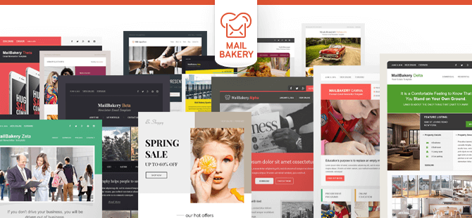
With email marketing, every element matters, and let’s be honest, crafting visually appealing emails that convert can be a challenge. So, if you need help getting that attention-grabbing HTML email design, MailBakery can give you a stunning look across more than 40 email clients and mobile devices.
MailBakery is here to help! We have hundreds of templates to choose from, or if you have a design in mind. We can bake one fresh!
To learn more about MailBakery and our services, contact our team!
Related Articles:
- Why Design Matters
- How to Create Visually Appealing Emails
- Fonts in HTML Emails – Limitations, Solutions and Industry Standards
- 25 Wonderful Examples of Animated GIFs in Email Marketing Templates
- 25 Excellent Examples of GIF Animations in Email Marketing: The Sequel
- Clever ways to use a CTA in your email marketing campaign that will drive clicks
- 11 Tips For Effective Calls to Action in HTML Emails
