Best Design Practices for Email Newsletters
Reading Time: 5 minutesEmail marketing is an efficient way to stay connected with your clients while also promoting your products and services, which is why it’s one of the most important tools in the business industry. With email marketing, you can easily and quickly reach target markets without the need for large quantities of print space, television or radio time or high production
costs.
Email newsletters play a crucial part in email marketing, because are cost effective, easy to edit and they help increase the brand awareness.
However, when designing a newsletter, there are certain requirements imposed by email clients and mobile apps that you need to keep in mind.
Today we will take a look at some of the best design practices for email newsletters that will help you out when you’re creating your own.
1. Keep the Width Around 600px
It is accepted that the standard width for most emails is around 600-650 pixels. There have been instances of wider designs lately, but you should keep it under 700px, just to be on the safe side.
Campaign Monitor held a simple reader poll to determine the maximum width that designers prefer using for email newsletter design. Below you can see the results:

According to their votes, 74% of web designers prefer using 550-650px as their maximum email newsletter width.
Meanwhile, around 20% chose 751-800px width and only 2% voted for 1024px, another 2% went for 751-850px and the final 2% was voted for 100% width (fluid layout).
Clearly, 550-650px email newsletter width was the undisputed champion of the poll.
The height will vary depending on the amount of content in the newsletter. You can make it as long as you want, but it’s best not to overdo it. Most people don’t like to scroll down too much.
2. Keep the Design Clean and Simple

Email newsletters are not as complex as website designs. Of course, they should have a nice and eye-catching design, but it should be somewhat basic and simple.
The cleaner the design, the easier it will be to code, and the less chance of any problems happening between various browsers and email clients.
3. Include Important Information in the Preview Pane (Fold)

Keep in mind that some of your subscribers just scan your email in a preview pane before they decide to click to read the entire thing.
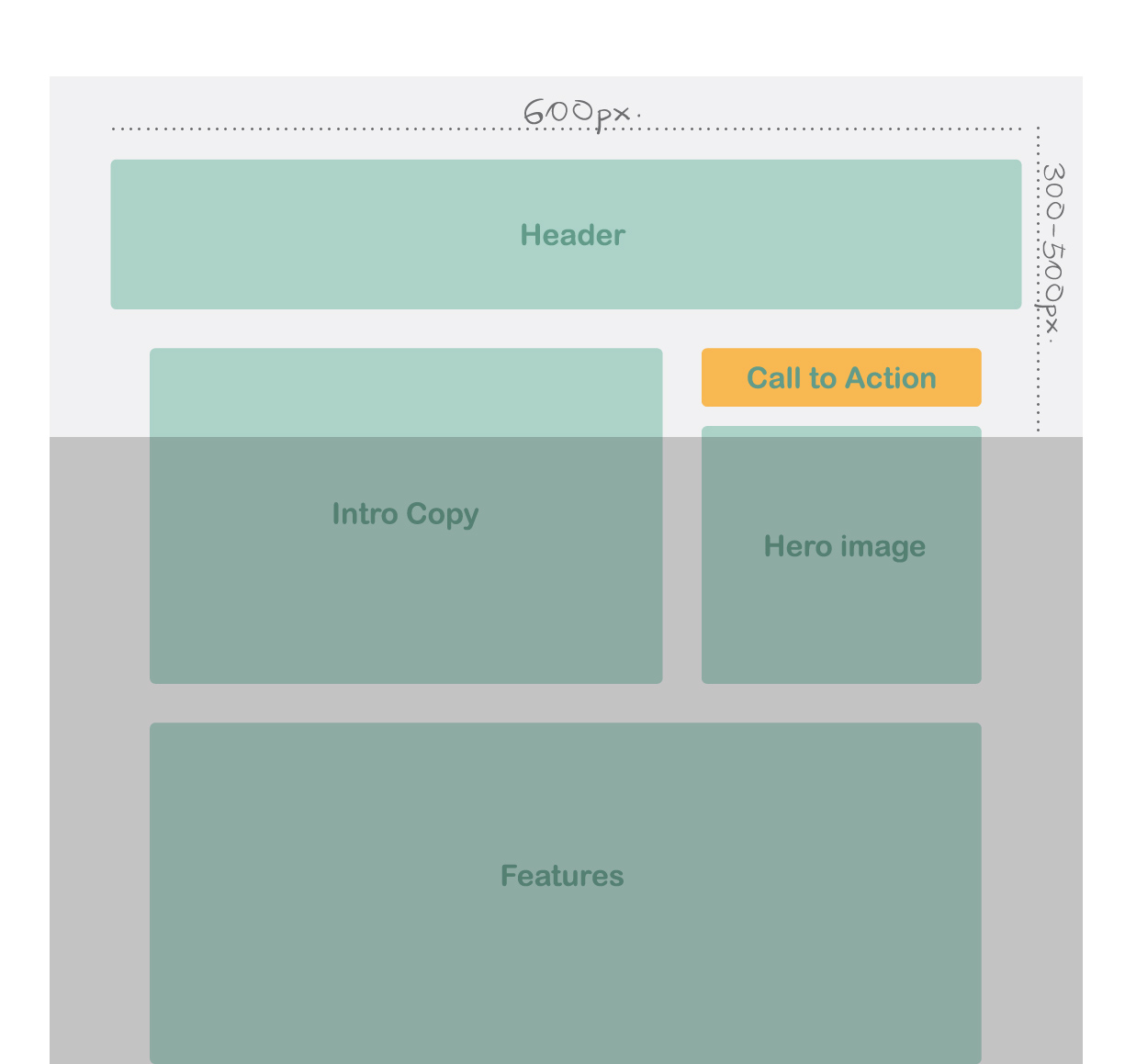
The average preview pane is around 300-500 pixels high, so make sure you include any important bits of your email in this area. First impressions always count.
4. Avoid Using Background Images

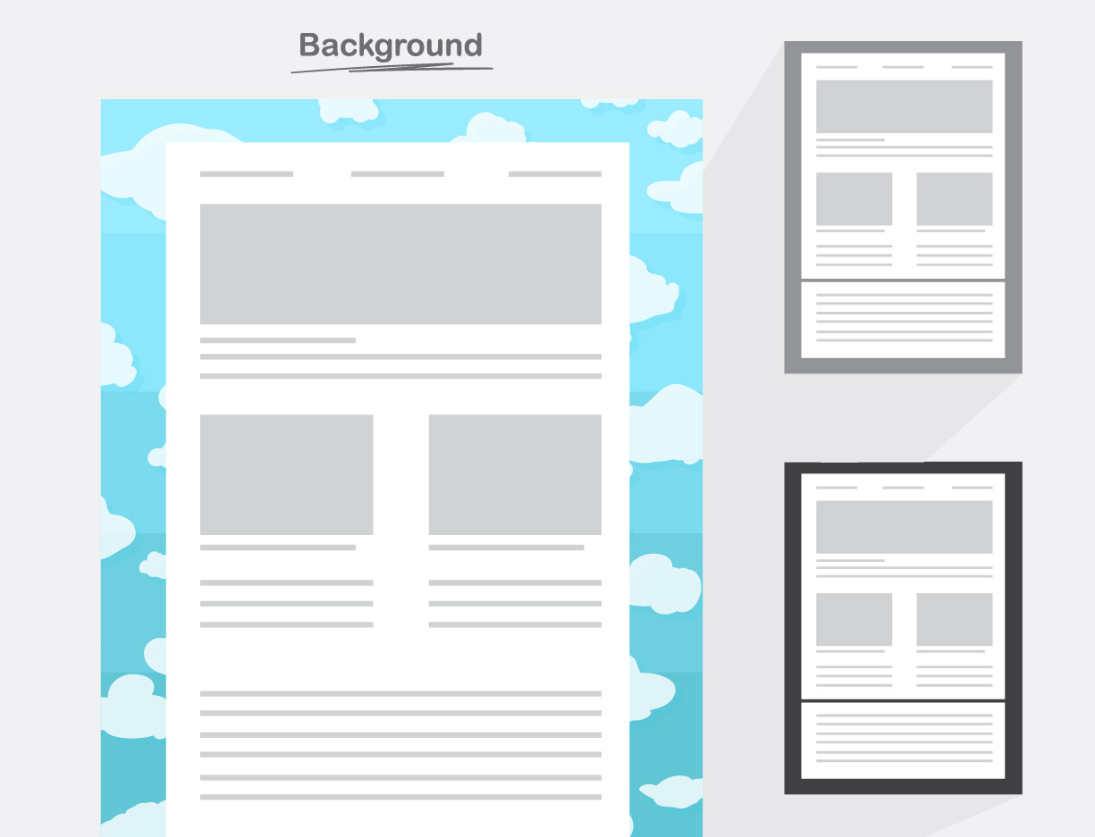
People use different email clients or apps and it’s very likely that they won’t be able to open that background image. Or maybe it will stretch and lose its quality, which will ruin the design of the newsletter itself.
This is why it’s a good idea to always use a solid background color as a fallback.
5. Don’t Rely on Images Alone
While you certainly want to include images to make your design stand out, don’t rely on them alone to sell your product.
Some subscribers are just not interested in seeing the pictures and have turned that option off. So always use alt and title text behind images to ensure that there is still important information appearing even when your images do not load.
6. Use Web Safe and Google Fonts

Choosing the right font for your email newsletter is a pretty important decision. Technically, you can use any font you like in an email, but if your subscribers don’t have that font available on their device, they are not going to see it.
This is why it’s best to stick with basic web safe fonts such as Arial, Helvetica, Tahoma, Times New Roman, Georgia, etc.
You can also use Google Fonts. They have a huge directory of various fonts that can suit your design needs.
7. Avoid Including too Much Text

It’s not a good idea to include too much text in your newsletter, because there is a risk of it ending up in the spam folder. It can also overwhelm the subscribers, prompting them to close the email before they’ve even read it.
Always use shorter text blocks that link back to full articles or product pages on your website or to landing pages. That way you will display just enough information to get them interested in reading more about it.
8. Choose the Color Scheme According to your Demographic

Each gender or age group responds to different colors. Be mindful of which hues you choose for your images, background color, font and call to action buttons. After making sure that you’re keeping true to your brand identity, think about your audience. By using specific colours based on your demographic, you can improve your results.
9. Make your Newsletter Mobile Friendly

Nowadays, smartphone usage is skyrocketing and so is the number of people that are reading email on a mobile device. A mobile-friendly email is an email that displays optimally between a desktop/laptop and a mobile device, ensuring that it will look great regardless of where your subscribers read it. Keep that in mind when designing your email newsletter.
10. Always Test

Always remember to test your emails thoroughly on all devices and clients. There are a bunch of rendering tools out there that you could use such as Campaign Monitor, Litmus and Return Path. They offer a full display of the rendered image in different clients and platforms, which can really save you time and anguish.
Conclusion
At the end of the day, your email newsletter design will be successful if it inspires your users to take action, generate revenue, or increase customer loyalty and awareness. This is why it’s a good idea to follow these best design practices. They will ensure that your emails render beautifully across all email clients and on mobile devices.
Do you need help with your email newsletter design? See what the MailBakery design team can do for you.

