7 Brands Using GIF Emails to Spice Up Their Email Marketing (+20 Examples)
Reading Time: 6 minutesThis article was last updated on September 1, 2020
Using GIFs in email isn’t anything new in 2018 but still, not many brands are leveraging the power of motion in their email marketing campaigns. Creating GIF emails requires a little bit more time and effort than making a static email marketing template but the effort definitely pays off. Motion in email marketing templates not only catches the attention but it opens a whole new field of opportunities to provoke the curiosity of your audience in new, exciting ways.
Today we will show you a few brands which definitely know how to spice up their email marketing campaigns by using GIFs. Hopefully, we will inspire you to test out this strategy for your next email campaign. By using A/B testing, send an animated GIF email to half of your audience, and a static version of the same email to the other half. You may be completely blown away by the results!
Without wasting any more time, let’s jump to some of the most famous brands using GIFs in emails. Enjoy!
1. Moo
Moo is a print and design company, one of the brands that spice up their email marketing campaigns with GIF emails. Here are a couple of examples that are fun and engaging.
While watermelons are not directly related to print and design, the following email template is very fun and provoking curiosity. The email comes with a subject line “Something sweet for you” and is definitely targeted to an audience who is familiar with the brand very well.

Here is an example of an email GIF which doesn’t take much time to be created but still manages to impress the recipient. Moo used a mockup of a few printed cards and simply switched a few different sets of looks.

2. Loft
Honestly, the fashion brand Loft has so many wonderful GIF email examples that we definitely had a hard time choosing which ones to include Their signature style is sending short email templates with one clearly focused message.
Look at this sweet email template of a melting ice-cream on a stick. It perfectly supports the message of “the hottest sale”!

Blinking has always been drawing the attention. For this reason, marketers use it in their email campaigns. This one by Loft doesn’t represent blinking exactly but it creates a similar effect by “pressing” each of the letters quickly.

Underlining is often used to highlight important parts of the text. Underlined words naturally draw the eye and Loft knows it. This email template bet on this technique to prompt recipients to click through.

3. Ann Taylor
Ann Taylor is another brand from the fashion industry which uses GIF emails to spice up their email marketing campaigns. The following GIF email example is a quite cute snowflake made into a ticking clock. The brand has acquired the same “short email” strategy as Loft to make subscribers convert. Using GIF, in this case, increases the urgency which the clock creates.

An animated hourglass or a sand clock in your email template is another idea to boost the urgency factor in your GIF email. Here is how Ann Taylor leveraged this tactic.

GIFs in email are quite useful in creating a path for the eyes to follow. Here is a great example for this trick. Ann Taylor sent an email template for September, whose letter disappear one by one leading the eye towards the call-to-action button.

4. J.Crew
J.Crew is a retail brand which sends brilliant GIF emails impressing all of their subscribers. A cute unfolding origami flower reveals a special offer which J.Crew has for their recipients – 30% off which is also written in their animated email template copy but hey, the GIF definitely nails the attention, doesn’t it?

Gifts on a moving carousel convey the feeling of packages which are on their way to you, thus making the recipient feel they already own the products. With such a strategy, the user becomes way more inclined to order, indeed.

Here is an example of a GIF email which we’ve seen many brands use – a product finishing. Such an animated image in an email template conveys the feeling that the offer will also finish soon.

5. Artifact Uprising
Birthdays are the perfect occasion to remind all of your subscribers about your brand and make them a part of the birthday participation. If you doing by using a GIF in email, you will catch their attention even more successfully! Here are two awesome birthday email examples by Artifact Uprising who not only sent emails to celebrate their birthday but to promote their brand with a special sale offer.


6. Banana Republic
Banana Republic is among the fashion brands which love sending GIF emails to their subscribers. The brand’s marketers certainly know how to leverage the power of motion. Not all animated email templates of Banana Republic show clothing but all of them manage to provoke curiosity.
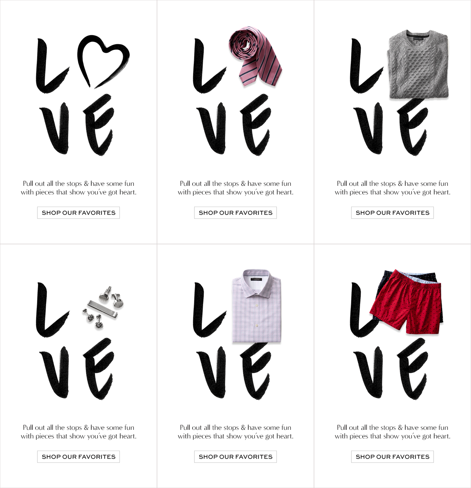
Here is one that we completely love. Maybe because it shows the word “love” switching the “o” with a heart and a few clothing products, thus showing diversity in a very clever way.

Fashion brands should always stay on the cutting edge of design trends. Just when holographic designs were in their peak, Banana Republic sent this simple GIF email template with a very attractive animated holographic background.

Fashion brands who offer clothing for men and women should certainly have a strategy of how to target their audience of subscribers. One way is to segment your audience by gender. Another way is… well, switching a girl model with a guy model in a smart GIF email.

Wordplay always grasps the attention and impresses with cleverness. Here is a cool example of such an email which says “Pine over this offer” and depicts pine branches and pine needles falling in the background.

7. Nasty Gal
Nasty Gal is one of the brands using GIF in email very successfully. Here is an email campaign which almost mesmerizes with its animated background showing a “30%” sale.

A GIF inside an email doesn’t have to be very obvious and intrusive in order to make an impact. In the following animated email template by Nasty Gal, just the middle block is animated with the model changing positions.

We all know that visuals in email templates draw the eye. But even if your email is based on plain text, you can spice it up by using a GIF animation, just like in the following example.

In conclusion,
We must all agree that GIF emails look great in the recipient’s inbox and can certainly motivate them to convert if done right. If you still haven’t tried this technique for your own email marketing templates, now might be the perfect time to do it.
We hope we’ve been helpful with this collection of GIF emails. If you have more favorite examples by these brands or others, feel free to share them with all of us in the comments below.
Wanna have a look at 35 Creative Welcome Email Examples?
