Email Design Trends 2017: 11 Effective Ways to Engage the Modern User
Reading Time: 5 minutesThis article was last updated on September 1, 2020
Тhe email design trends 2017 move towards cleaner and lighter shapes and forms. The email marketers focus on more classic layouts allowing them to manage their email content right from their email marketing platforms.
Interactivity is already applied by many email marketers. However, the coding technologies used to create these beautiful emails are not supported by all email clients… yet. So, an important tip here is to always use a static fallback version of your interactive creatives.
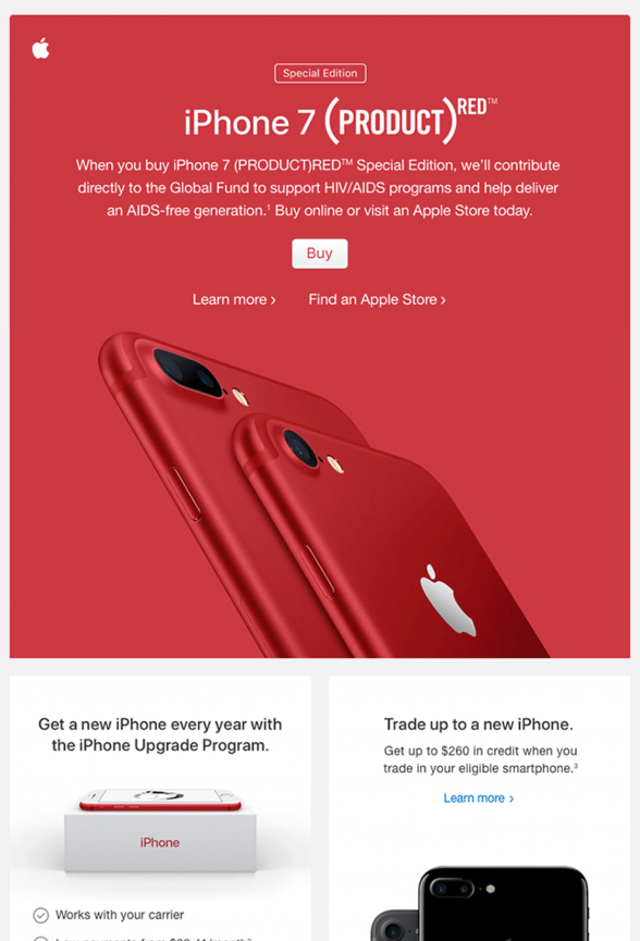
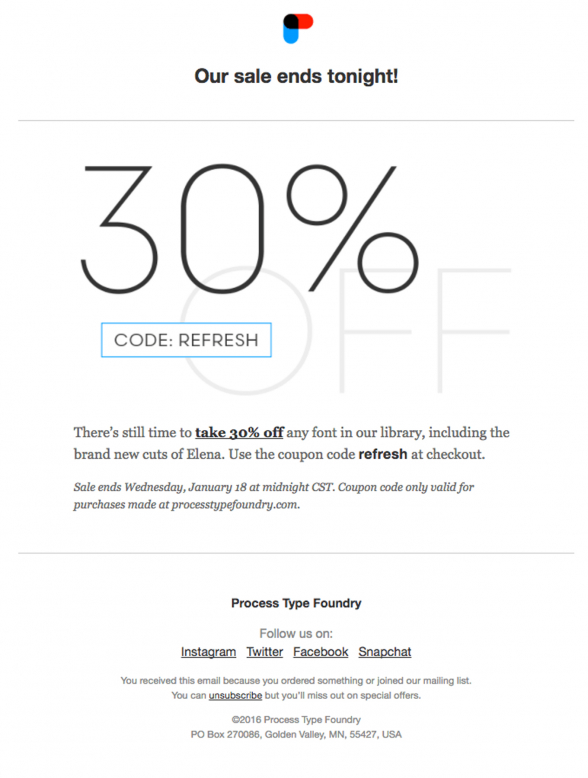
1. Use Bright, Solid Colors
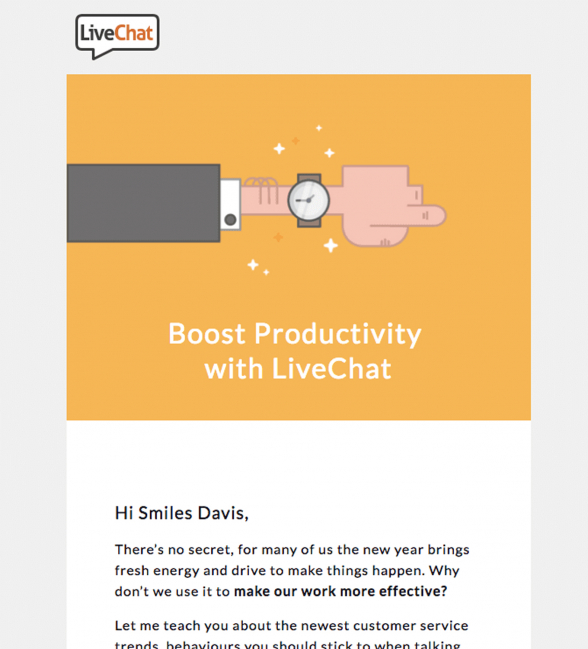
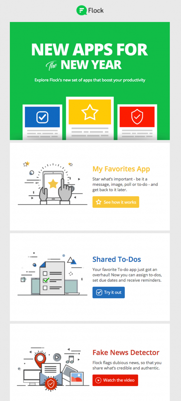
To catch the users’ attention we see an email design trend using solid, vivid colors. Works inevitably!
Once you nail the user’s attention, you’ll have a few more seconds for your next move, as they are figuring out what your email is about. Don’t let them slip. Crack them immediately with a bold one-liner containing your value proposition. This is your email marketing “one-two” combination which will earn you the reader’s attention in a split second.
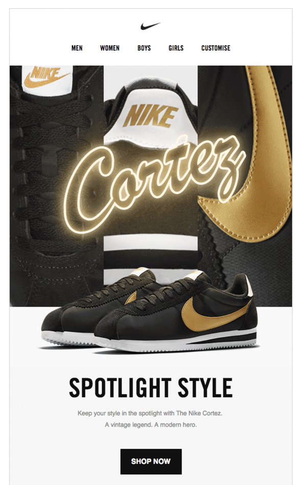
2. Prefer Big, Crisp Images
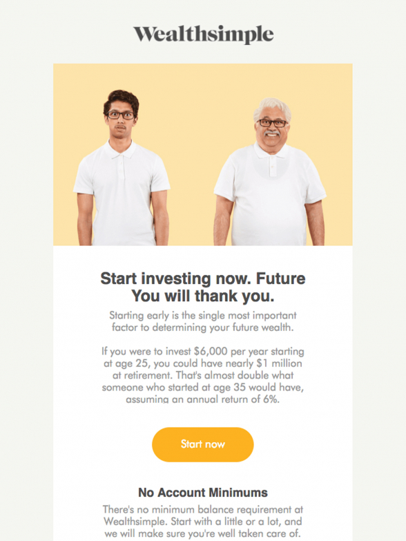
With the development of mobile phone screen sizes and quality the effect of high-res images gets even stronger. Nothing beats a visual ad that features a big, crisp image of your product or the happy faces of your clients (while using your product). Don’t forget to use retina-ready images for all your email marketing campaigns. In 2017 this one is a must.
3. Be Smart and Fun with GIFs
Some mobile devices are capable to play videos directly in email. However, in order to present an image in motion to all your readers, you still have to use .GIFs.
GIFs are living their second life in email and rightfully so. This is one of the email design trends 2017 that is here to stay. GIFs stay firmly in the email templates, giving them a fresher look and engaging readers on the spot.
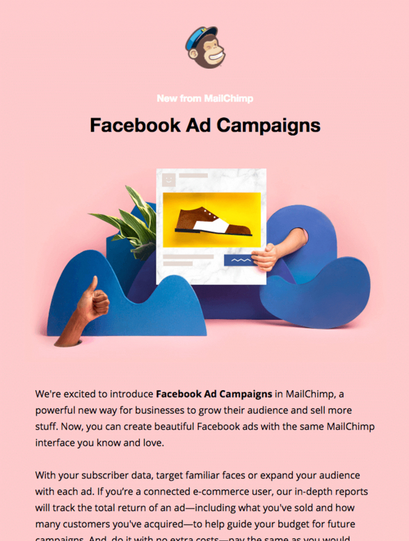
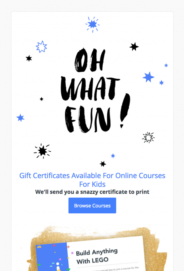
4. Amuse with Illustrations
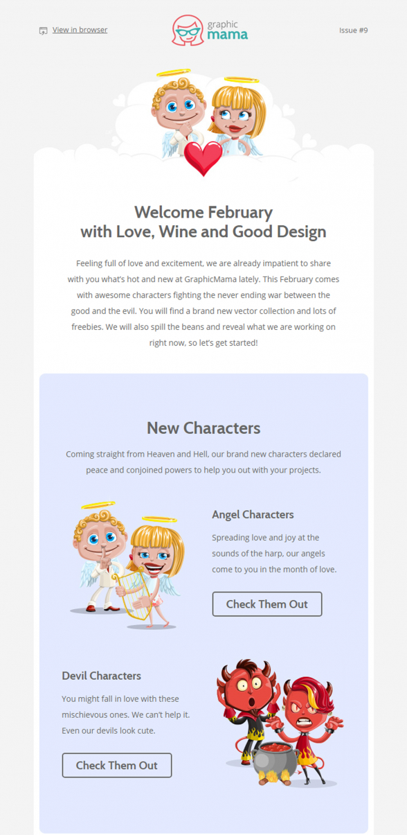
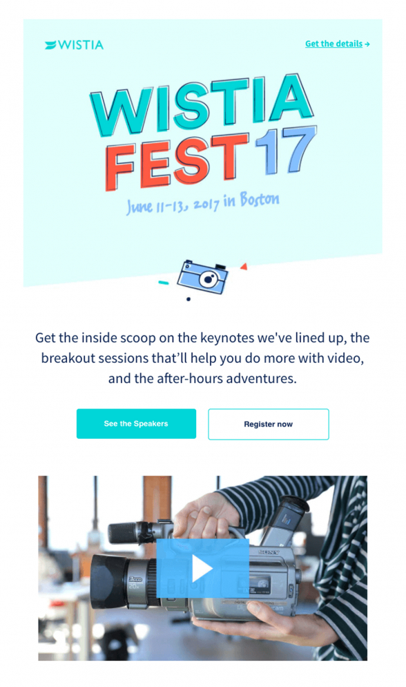
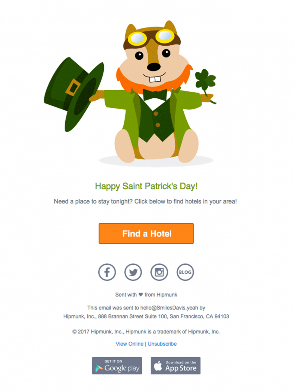
Using illustrations in email is not a new email design trend at all but we see a definite rise in the use of cartoons and mascots of any kind as email design elements. This is yet another move that aims to catch the reader’s attention right from the start. Moreover, it appeals to their softer side with a harmless cartoon character. A smiley character always seems friendly and helpful, plus you may assign some “superman” powers to the mascot that will make it even more lovable.
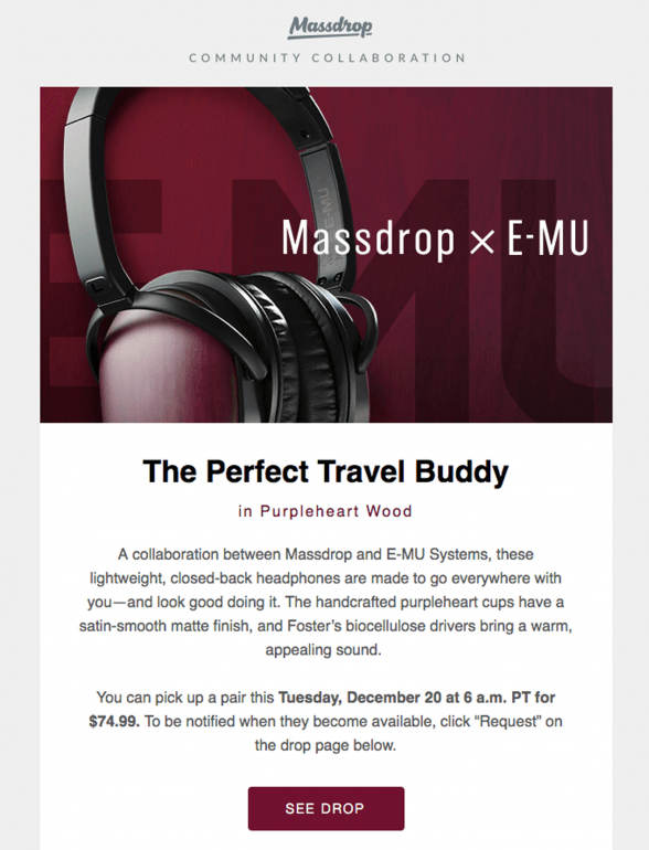
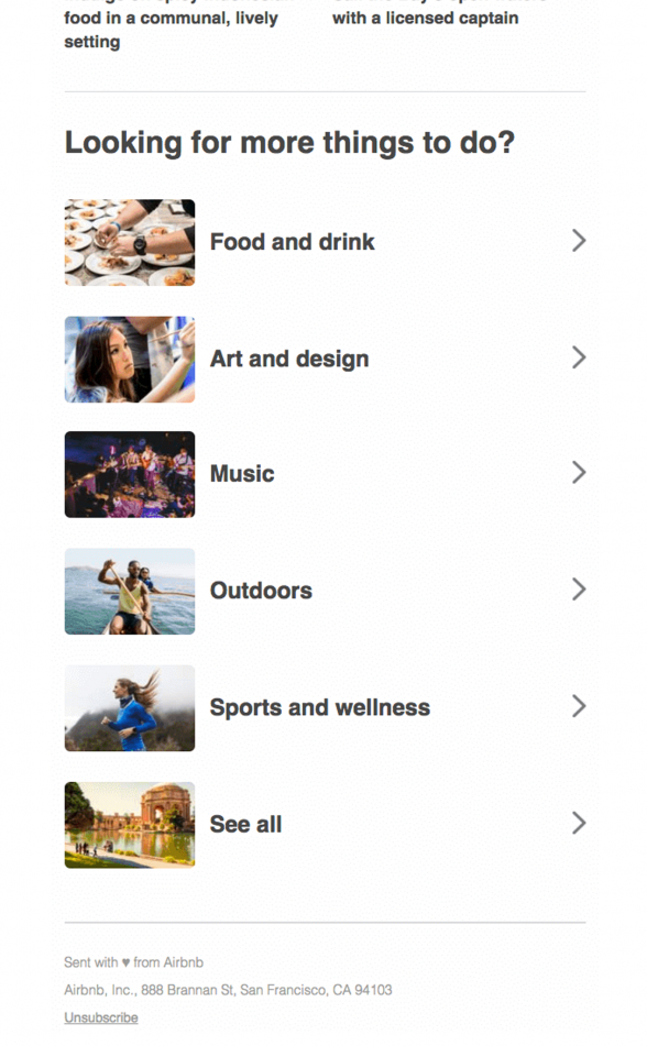
5. Use Logically Ordered Layouts
The fancier the email designs, the more time your readers will spend with your message. An email design trend that we’ve noticed here in MailBakery is that clients who have experience with email marketing prefer more classic layouts. Their templates usually start with a big image with a title across followed by text, followed by image, followed by text and so on. This way the user simply scrolls down through the email while going effortlessly through its properly-ordered content.
6. Showcase on an iPhone
This is a phenomenon many digital marketers take advantage of. It’s like having a movie star to endorse your product. When we showcase our products or services on iPhone, we benefit from the aura already associated with the iPhone – high quality, innovative technology, stylish design. The combination of a white iPhone showcasing your products in a mobile layout boosts the credibility of your offer. Call it Psychology of Marketing and Advertising 101, but this is one of the email design trends 2017 that is good to keep an eye on.
7. Enlarge the Font Size
“The bigger, the better.” This is the slogan for one of the email marketing trends 2017 towards the use of larger font size. It actually makes a perfect sense considering the ever-growing mobile traffic experienced by email marketing. We’ve always used larger font sizes for our email titles and section titles. However, we’re talking about pushing the ante a notch higher. Therefore, make your texts shorter but larger in size like punch lines. Say exactly what the reader will get from you. In addition, make sure that they won’t miss your message.
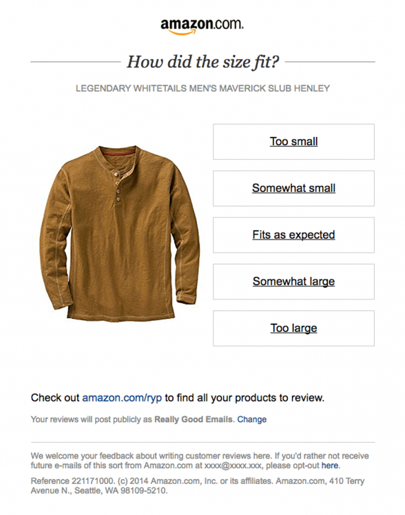
8. Increase the Email Interaction
Email marketing is moving firmly towards enhancing interactivity in emails. However, not all email clients render correctly interactive emails. Therefore, to lure your readers into interacting with your emails using standard email coding, present your calls to action in a subtler way. Present them as options, word them in a non-intrusive way. Also, color and style them as buttons, rather than just links. Think of your design as something the reader should feel comfortable interacting with and not being afraid to play around with.
9. Embed Videos
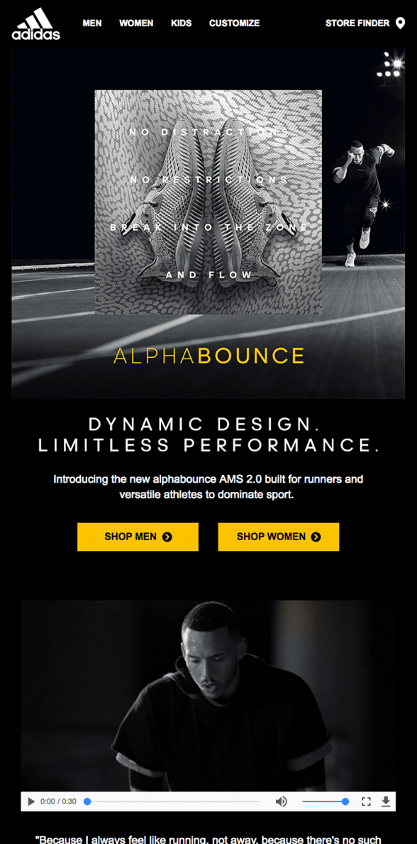
Video is the single greatest way to advertise your products. We’re living in the age of video and although it didn’t kill all the radio stars, it’s the visual media that attracts the most eyeballs. We’re so much used to video tutorials, video advertisements and video content in general, that it’s the only media we really pay attention to. Anything in writing we’re simply scanning on the go. Using video in email is a very strong email design trend. Don’t miss the opportunity to feature your video content in your emails for all your readers who prefer watching over reading.
10. Use Solid Color Backgrounds
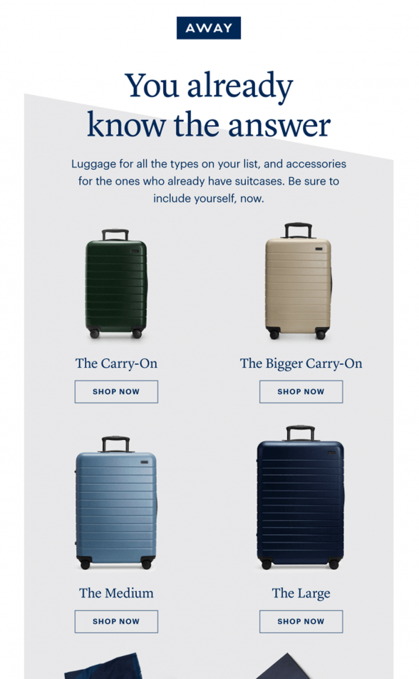
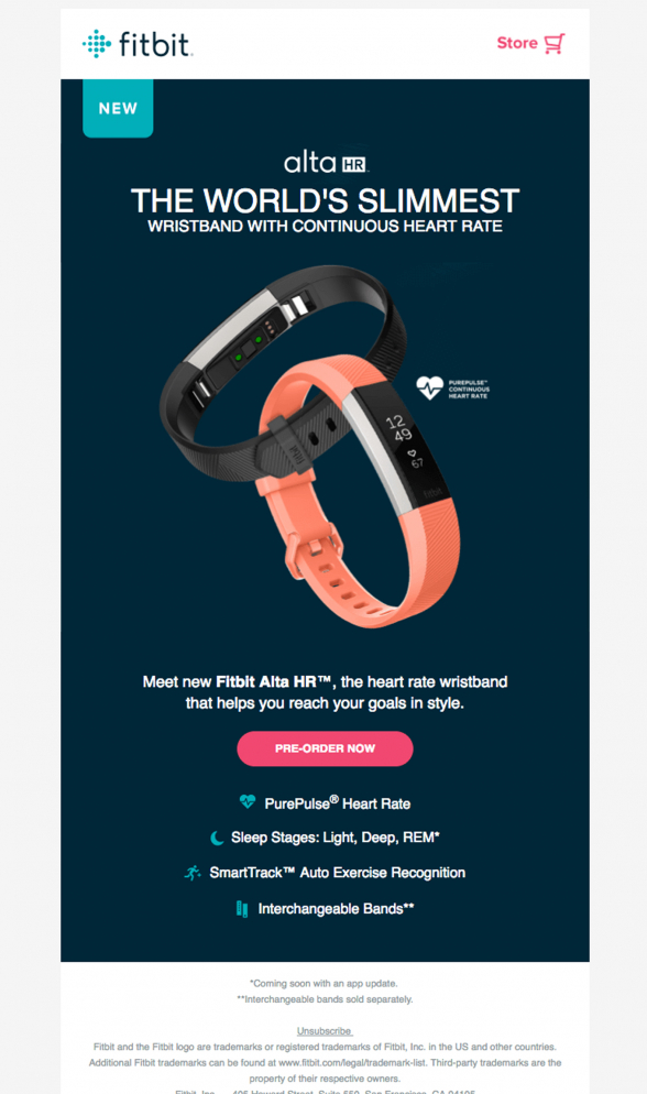
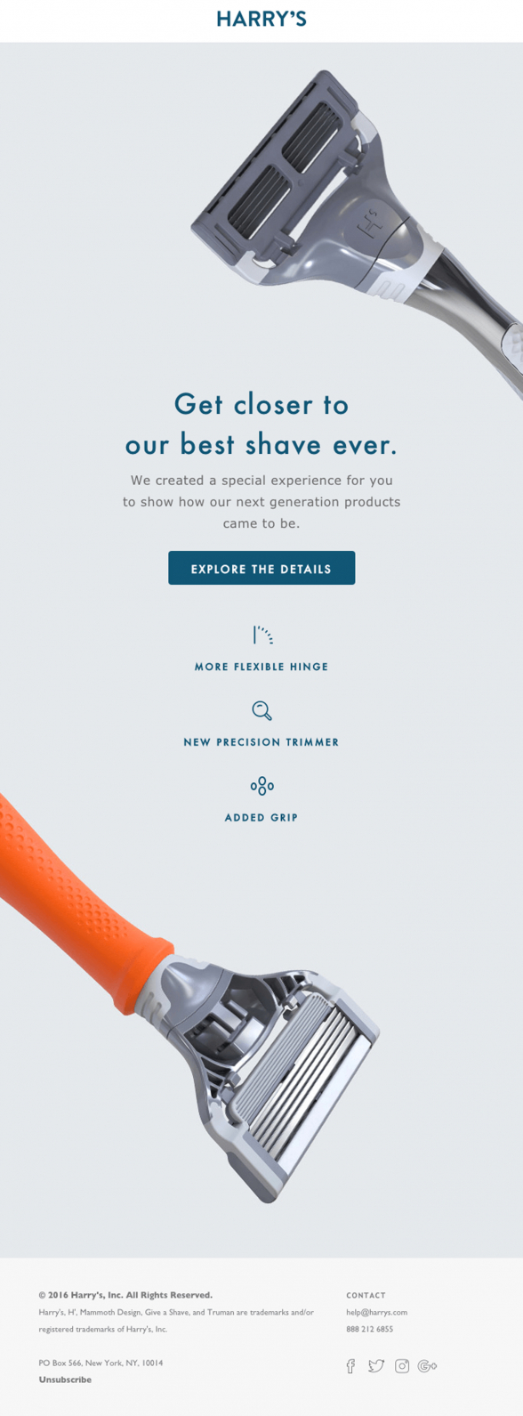
Using solid color backgrounds help your images stand out. This is very important when presenting a line of products. Avoid combining the product images with backgrounds featuring multiple colors or shapes. The busier the background, the harder it is for the eye to focus on the image placed over it.
11. Calls To Action In Contrasting Colors
This is not a very modern design trend, but it’s an email design essential, so I decided to include it in this review of email design trends 2017. The best way to style a call to action is to place in on a white background. For a maximum effect use bright orange or red colors for the button. In some cases these colors may not match your blue, purple or green designs, but I would say that this is even better. The purpose of the CTA styling is to drag attention.
Conclusion… Or what we’ve learned so far from email design trends 2017
Looking into the email design requests we’ve received so far in 2017 we see that there is a trend in the email template design towards a more simple and clear look. During the last several months we’ve been constantly getting requests from clients who prefer simpler and lighter designs for their emails. They say that the information they send out should be easily digested by their email recipients. Also, if they use complicated email designs, the users would get confused and the message of the email won’t reach them.
Another benefit from the lighter email design is that the code behind the design gets lighter too. This allows the email to load more quickly and render better. Remember that every column you add, every background text or product example, adds to the lines of code used to display your email.
The simpler the design, the more inviting it is. Your website is there to provide the user with detailed information on your products. Your email has to catch the user’s attention and channel it towards the website.
There used to be a time when in order to get out of the constraints of the email coding, we coded emails with crazy designs. They were mostly consisted of images and featured very little live text. In contrast, most email marketers today want to have the text displayed separately from the images. This way they could make text changes using the template editors of their email marketing platforms. These editors allow you to update your titles, paragraphs, buttons, etc. This is yet another reason why marketers prefer cleaner designs. It gives them the ability to manage the email content themselves.
Need help with your email designs? Check out the opportunities at Email Template From Scratch.
As we work under strict NDA policy with all our clients, we were not able to use example emails from our own work. We’re thankful to our friends from www.reallygoodemails.com for letting us use their email gallery.

