25 Examples of Sportswear Brands’ Marketing Emails
Reading Time: 5 minutesEver wondering what the marketing emails of your favourite sportswear brands look like?
Well, we did. That is why we put together a list of 25 examples of our favourite sportswear brands’ emails.
We all love these brands for their products, but these global corporations hire some of the best marketing teams available too. Why not learning a thing or two about email marketing, while scrolling through some cool sports gear?
Below you will find how they structure their emails, how their products are presented and what calls to action they prefer.
Learn from the best – 25 Examples of Sportswear Brands’ Marketing Emails.
Nike, one of the biggest sportswear brands in the world, prepared this classic email template. It has a lot of white space, which helps separate the various sections. It also has a top navigation menu which lets you access directly the desired section on their website.
A French version of Nike’s email offering links to various products and featuring again a top navigation menu. Although it is not the most colorful template you could get from Nike, the color scheme is consistent throughout the email template.
With Jessie J on top, this email template from Nike will grab instantly a fan’s attention. The English singer has her own training program and her own Nike sportswear line, which the company offers to their client with a clever call to action – Shop Her Look.
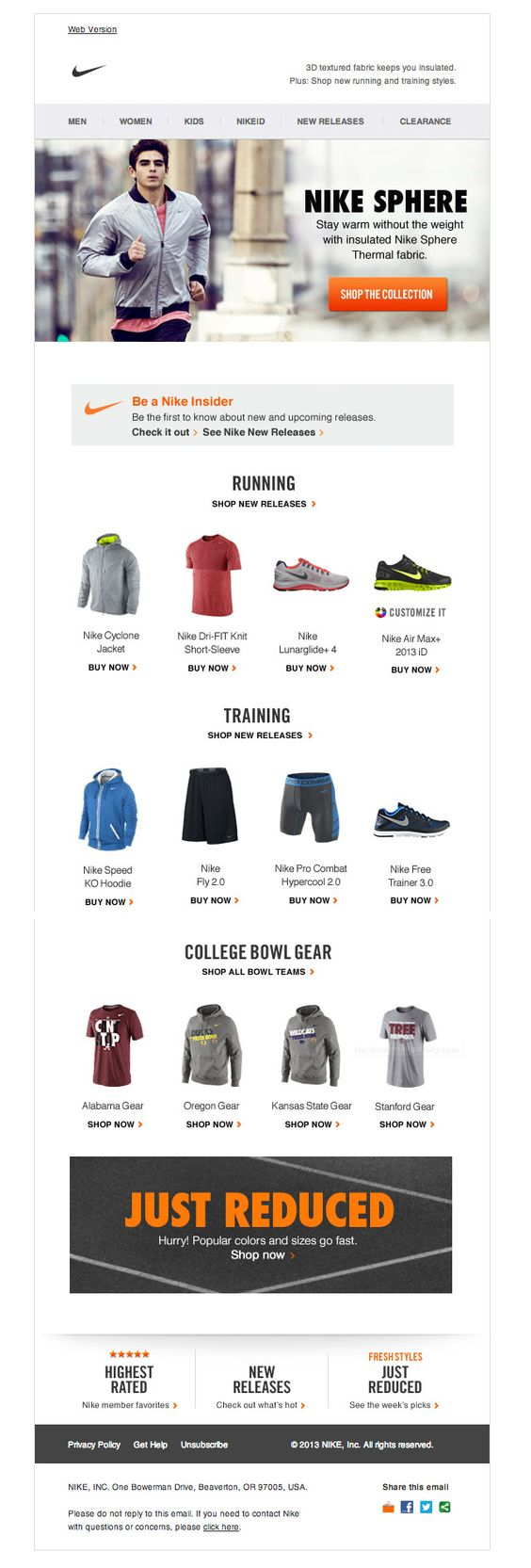
This email template from Nike focuses on those who workout outdoors. The email header offers Nike’s sportswear line made with a patented technology called Nike Sphere. A quick google search will tell you that this technology is used mainly in Nike running apparel.
Here is an email from Converse about there custom design program. They let you know that they have added some new colors and prints to their gallery that you may use to customise your pair of Converse. They also offer links to their current collection in case you are looking for some inspiration.
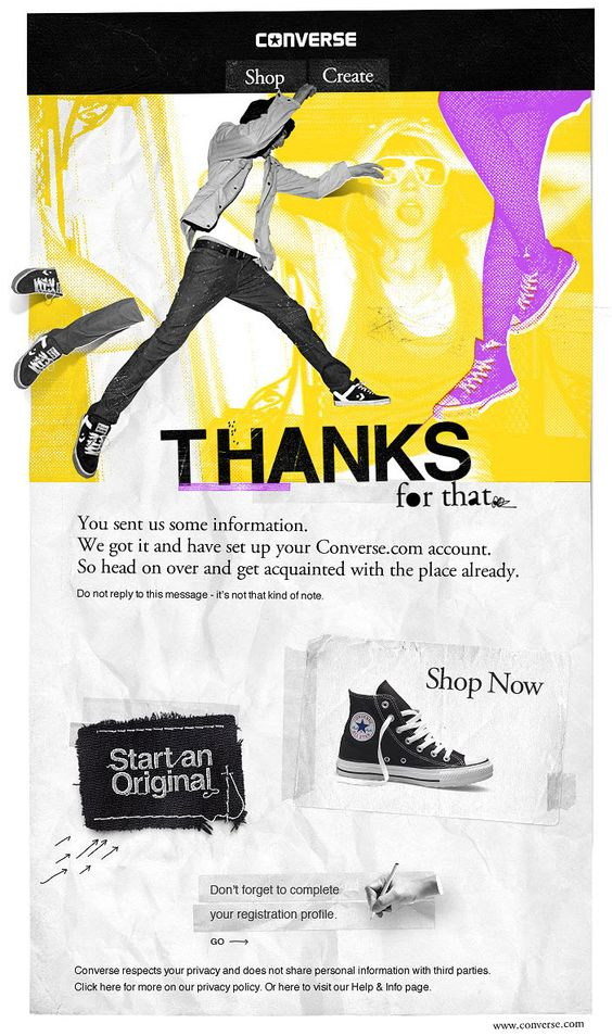
That is the “Thank you” email you get when you set up an account with Converse.com. The email design brings strong grunge flavour and offers two main calls to action on top – Shop and Create. You may choose to shop from the latest Converse collection or create a custom pair of Converse sneakers.
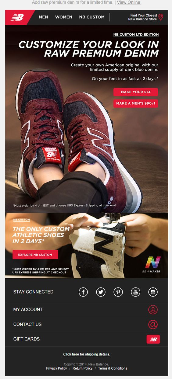
New Balance also have email advertising their custom shoes program. In this case they urge their subscribers to hurry up, as the dark blue denim they may use for their custom pair of New Balance is in limited supply. Another message they use to lure their readers into purchasing is “On your feet in as fast as 2 days”.
Reebok’s connection with CrossFit in recent years is very strong and that strong should be their NANO trainers made with kevlar mesh. This email template has dark design that screams toughness and durability. The main message is stated clearly in the hero image “Armed for Action”.
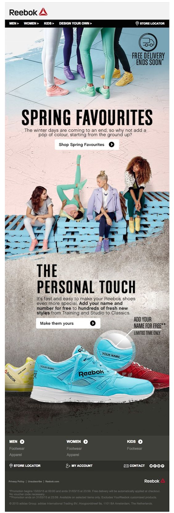
An email template from Reebok celebrating color and the end of winter – Spring Favourites. The badge in the top right corner “”Free delivery ends soon” urges the reader to hurry up with his purchase. The beneath-the-fold part of the email offers to customise your Reebok trainers for free adding a name or number.
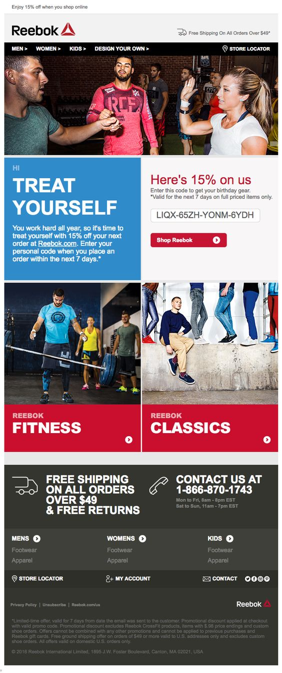
A discount email from Reebok offering 15% off on their products. The header image follows a main theme for Reebok today – Fitness. However, in the lower part of the template you have options to shop either Fitness or Classic collections. The email does not leave you wondering what to do next, as it features big, red calls to action.
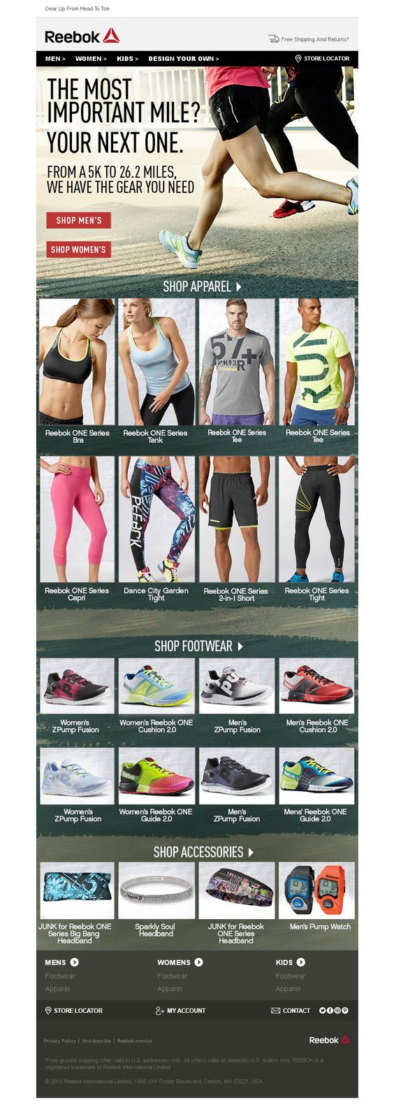
Running is one of the most popular sport activities and Reebok have you covered there too. This email, opening with an inspiring paragraph in the header image, offers their running apparel collection. The body of the email is separate in three main categories – Shop Apparel, Shop Footwear, Shop Accessories.
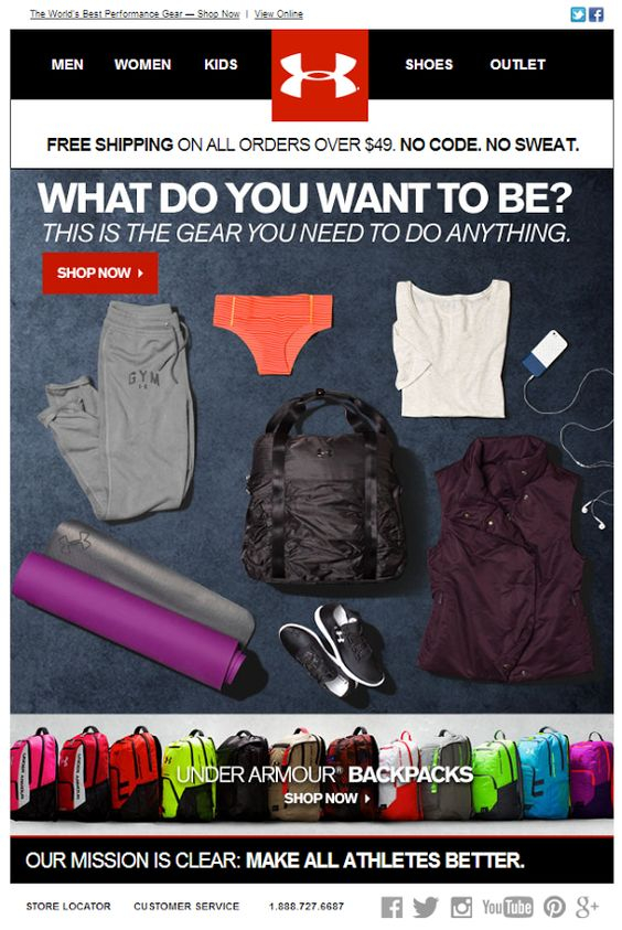
Under Armour sends this short email to their readers to offer all the essentials they need to start training. The big red Shop Now button will get them to the Under Armour website, but if they wish they may use the top menu to navigate to it too.
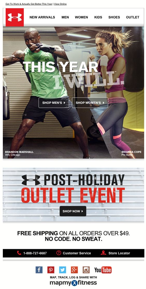
A post-holiday outlet email from Under Armour, starting with a New Year’s resolution quote “This year I will”. The hero image is a background image for the main call to action buttons – Shop Men’s and Shop Women’s. Again the email template is short and you could see the whole message without much scrolling.
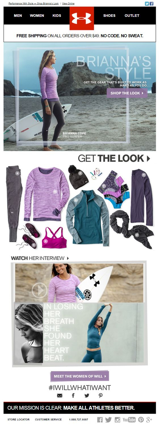
An Under Armour email offering Brianna Cope’s line of sportswear. The pro surfer is featured in the hero image with the items from her signature collection underneath. The color scheme is consistent throughout the whole email. In case you don’t know Brianna, you may get to know her from the videos linked beneath the fold.
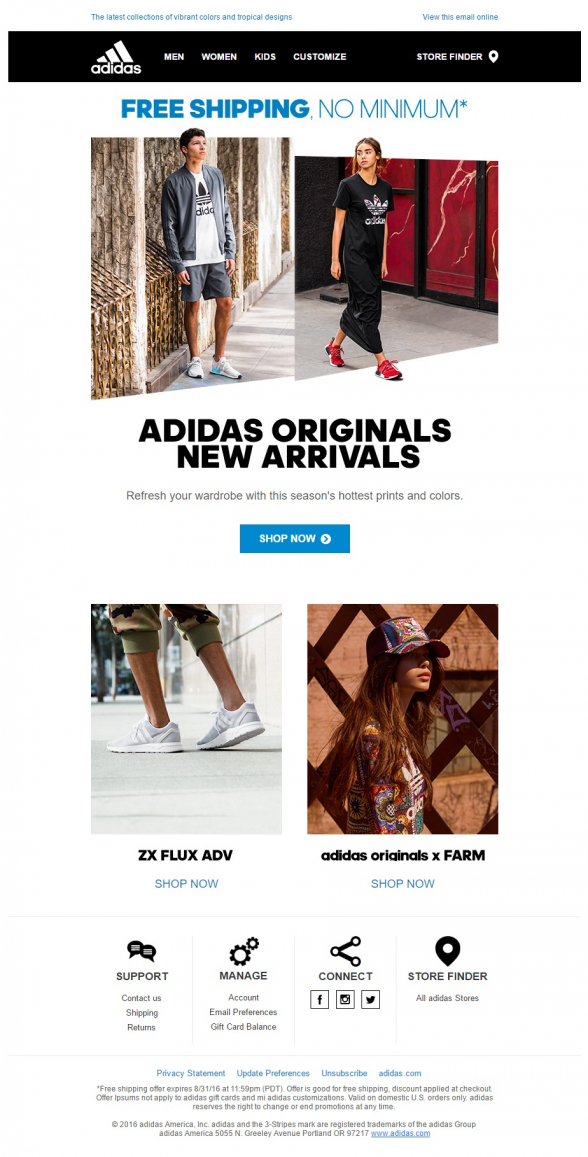
Adidas, the German sportswear company, presents its new Originals collection with this email. They have top navigation menu for quicker access to the four main sections on their website. The images are spaced well and there is a clear call to action in contrasting blue in the middle of the email.
With this email template Adidas presents their new ladies collection. On top they confirm that there is no minimum purchase required to avail of the free delivery. Then we have three rows of images and links following a checkers board pattern. The call to actions are clear and match the images next to them.
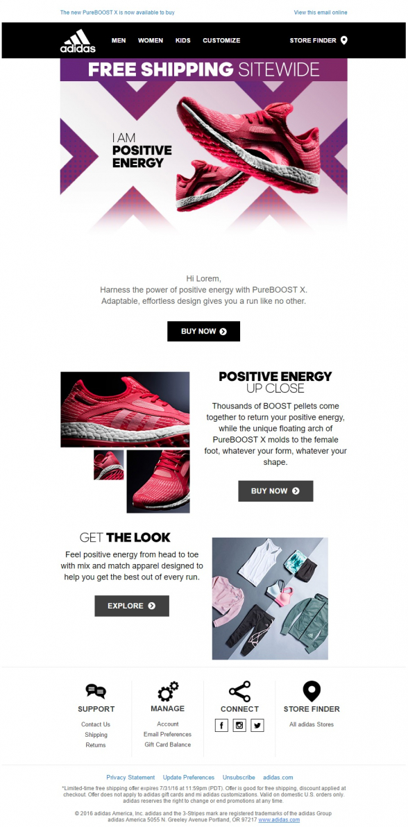
Another email for the ladies from Adidas. The color scheme features pink and purple, with the graphics’ colors matching those of the product. Again the calls to action are clear and contrasting to the white background. The email focuses on the promotion of a single product featured in the hero image.
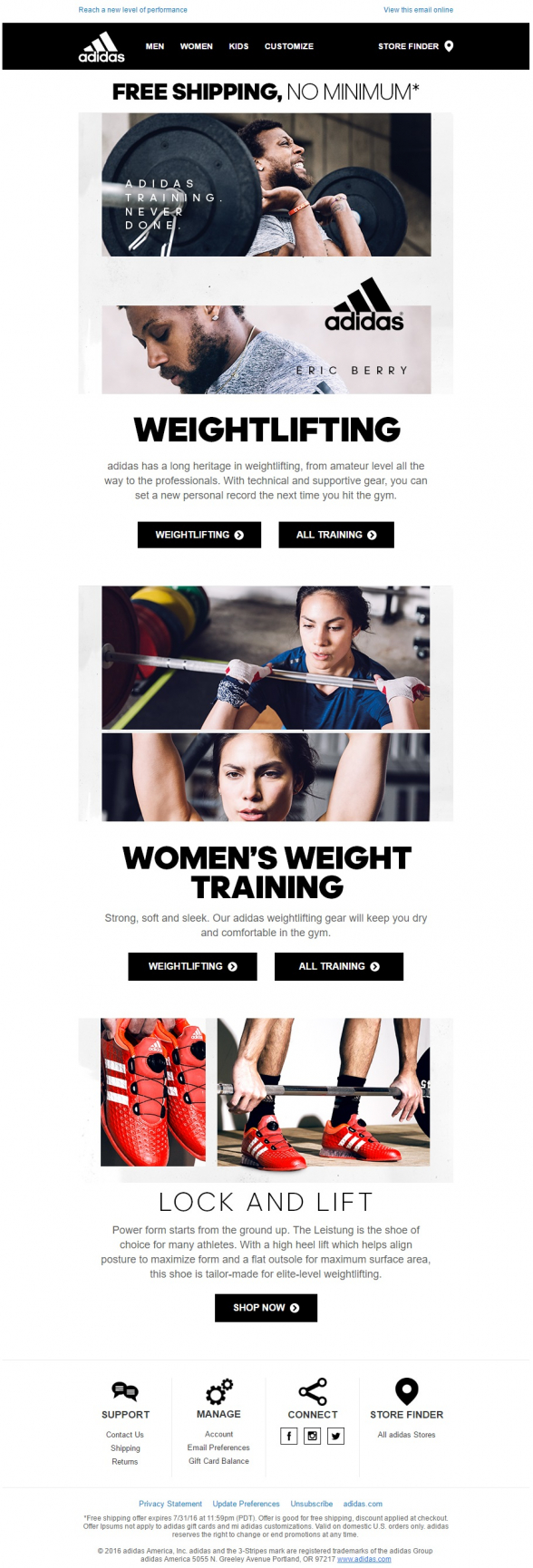
Adidas focuses on a particular client segment with this email. The reader is informed about the topic of the email with a clear hero image and big, bold title. The color scheme is black and white and the email features clear links to the website.
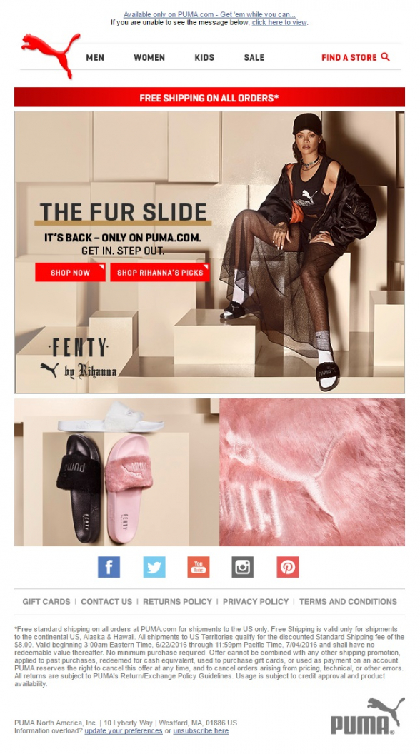
Puma are lucky to have such a huge pop star on their side. It is enough to open the email and you are going to stick with it for at least few more seconds, trying to figure out what is it that Rihanna offers to you this time. These fluffy flip-flips may not be the most stylish product Puma has offered, but it is the power of the Caribbean star that is going to make them fly off the shelves.
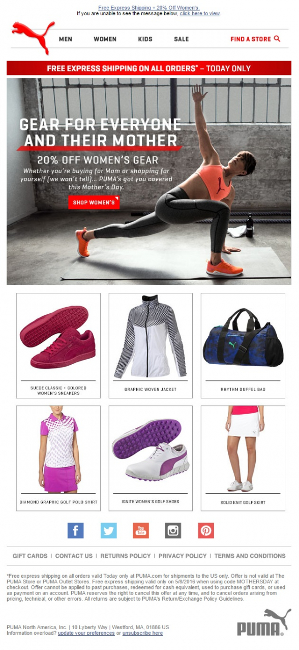
A Mother’s Day email from Puma with classic layout. The top navigation is followed by a large header, which is a background image for the main message and the bright red call to action. Underneath, we have six products in two rows. All products are evenly separated and shot on white background.
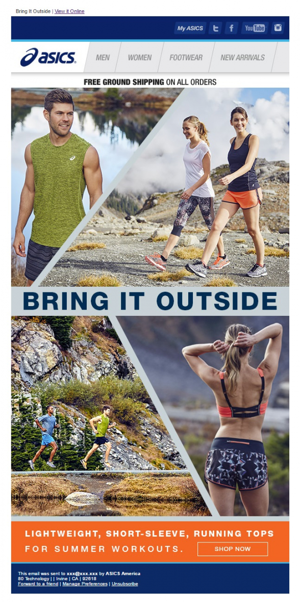
Beautiful, poster-like email template from Asics, focusing on a single product – lightweight running tops. The email is consisted of 4 big images with a call to action underneath. In case you are interested in some other products you may access all collections from the top navigation bar.
Another email from Asics focusing on a single product, instead of collection. The trainers in question are featured in three separate training situations, which is to say that they are multi-purpose training shoes. They come in different colors and offer models for both men and women.
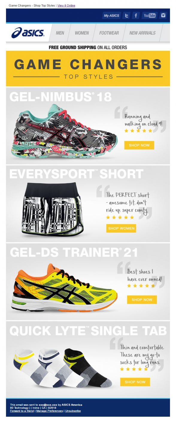
Asics scores a winner with this one. This is a very product-focused message. Four big images of the best summertime, running products or “top styles” as Asics call them. The email is very intuitive, the four products are like big, colorful icons, just hit the one you like.
Here is a long email from The North Face with multiple call to actions. The email starts offering a line of backpacks and prompting the reader to shop for them. Beneath the fold you may also explore a store locator and adventures locator.
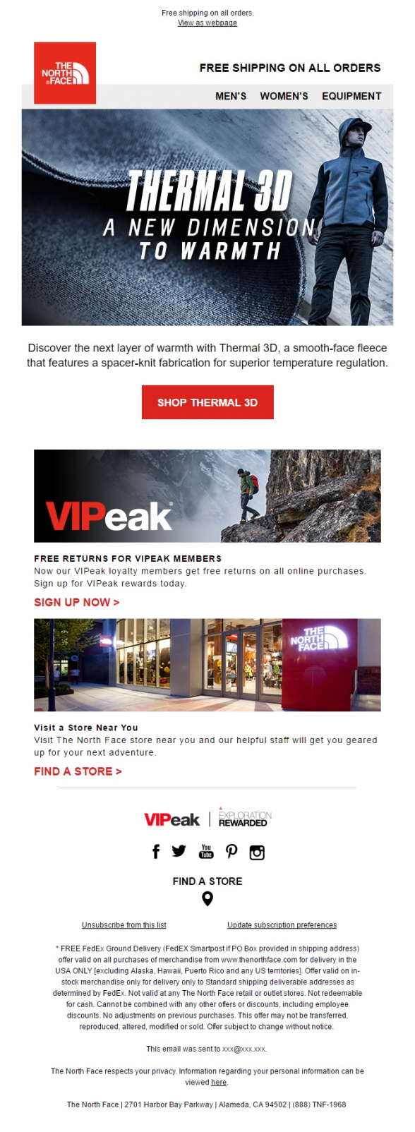
With this email The North Face introduces their subscribers to a new fabric they are using for their clothes, Thermal 3D. Store locator and offer to join their loyalty program come next. This email is much shorter and allows the reader to focus easier on the main message.
You like these designs and you wonder where you could get one done for you? No need to look any further. Check out our Email From Scratch page and let us know what your product is about.


