How to Create Visually Appealing Emails
Reading Time: 5 minutesEmail marketing is used to build strong relationships with consumers and to boost brand awareness. With a good email marketing strategy your brand can stay fresh in your customers mind’s so when it’s time for them to make a purchase, you are the first brand they turn to.
A strong email newsletter is a powerful marketing tool that brings several benefits. That is why it is so important to make sure your newsletter design is visually appealing. A good email newsletter, that is easy on the eyes, makes it more likely that your readers will click through, ultimately driving sales.
So, what makes an email visually appealing and how do you do it? We’re here to share everything you need to know to be successful.
Create A Header

Can you imagine picking up a book without a title? Or opening up a magazine or newspaper without a title? Your header is the very first step to a visually appealing email.
Every newsletter you send out should include your company name and logo, so that you continue to build a strong brand identity.
There are several tools out there that make it easier to include headers so that you don’t have to individually create graphics for an email. The great thing about email marketing is you don’t need graphic design experience to send visually appealing emails.
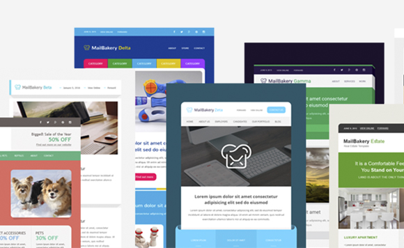
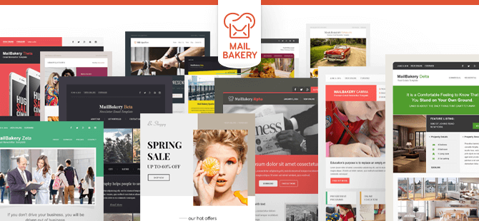
At MailBakery, we are here to craft the perfect email templates, so you don’t have to spend a ton of time on graphic design. Once you create your header, you can use it over and over again.
Find a Color Scheme That Correlates With Your Brand

Your newsletter must have a color scheme that fits your brand. If you send emails that include different colors every single time, it gives your emails a disorganized look that does not fit in with your brand.
Avoid Unusual Fonts

When finding fonts for your newsletter, it’s important to consider how the newsletter reads. Fun and creative fonts might look interesting, but the truth is, it’s hard for most people to read. Your top priority should be getting the message across.
As plain and simple as it may seem, consider using basic fonts such as Times New Roman or Arial. Once you have a basic font, it’s also important to keep the fonts unified throughout the email. More than one font will make the email seem disorganized and cluttered, whereas one plain font will make it look clean and easier to read.
Use Subheadings

You might have noticed that newspapers and magazines have several different sized headings to break up content. Imagine what an article would look like with one big chunk of content? It would seem difficult to read. Like the rest of your content, your subheadings should be in fonts that are simple and east to read. The size of the subheadings should be a bit smaller than your heading but larger than the other content in your article.
Stack Content

The content in your email does not have to be spread apart. For instance, you can have text laid out over an image. This can help to enhance the design of your email, but it can also help to save space while not cluttering the design of your email.
Use Images… Lots of them!

The perfect email design has the right balance of text and images. Text is important but images are also important to grab your readers attention while breaking up the content. The pictures that you add to your email should relate to the text that’s in the email and it should be a high-quality image.
Prioritize Content
The layout of your content should be thought out. No matter how much or how little content is in your email newsletter, it should flow, and the most important content should be placed at the beginning of the newsletter.
Utilize Emoji’s

Today, we often use little icons known as emojis to express emotions. Emojis can be used in the subject line of your email and maybe even throughout the email. The key to using emojis is to not overdo it. Keep in mind that the text is the most important part of your email while the emojis serve as small accents. Too many emojis can overwhelm the reader and create more clutter throughout the message.
Emphasize Call to Actions

One of the most important parts of your email newsletter is the call to action statement. Your call to action statement is what you want your reader to do. For instance, do you want them to buy a product? Follow you on social media? Click to your website? Your call to action statements are ultimately what will drive the success of your email.
Your call to actions should be short and precise. The purpose of this is so that your readers aren’t confused as to what you want them to do. There should also be a colored button that stands out and captures the readers attention.
Also, you will want to focus on one call to action. The last thing your readers want is a ton of colored text boxes asking them to do something. If you more than one call to action button is needed, it’s time to send more emails.
MailBakery: Helping You Craft Visually Appealing Emails

When it comes to crafting emails, your email design is one of the most important elements. It might seem like a lot of work but that’s why Mail Bakery is here to help!
Don’t stress over the details of your email; MailBakery can craft a design that attracts readers and fits in with your brand.
We have several templates to choose from, or if you have a template in mind, we are happy to code the design.
Consider the tips mentioned above and chat with our team so we can design the perfect emails for you.
Ready to get started? Browse our sample page and let’s get to baking!
