6 Advanced Techniques for Interactive Email Design
Reading Time: 4 minutesCompanies across different industries compete every day to catch clients’ attention and influence their choice and email marketing has proven to be an excellent tool for doing this.
As the number of interactive techniques we use in email design continues to grow, the email marketing solidifies its position as a great marketing tool.
With the latest updates in CSS we now have the opportunity to include short animations to present our products, hide long menus behind a single button or add small, moving objects on key spots to make our designs lighter and our message stronger.
Unfortunately, not all email clients support these advanced email design techniques yet, but if you check your campaign’s “device & user-agent” data you will easily find who these messages will be displayed with and who has to get a fallback version of your email.
Today we present the 6 Best Advanced Techniques for Interactive Email Design.
Carousel & Image Rollovers

Carousel

Image Rollovers
Carousel
If you wish to add a product gallery on your newsletter that does not require scrolling to be viewed, you have the option of using Carousel. Carousels allow you to display more than one piece of content in the same prime area of your email newsletter. Along with that, because more content appears in a better spot on your email template there is a greater chance for readers to see it.
To design effective Carousels we recommend following these 6 rules:
- Include up to five frames within a carousel, users will rarely engage with more than that;
- Display sharp-looking images and clear text that are in line with the email’s message;
- Show the user which frame he is on and how many frames there are in total;
- Use navigation controls that are large enough to spot and click;
- If you have separate buttons for each frame, make sure that each button looks different;
- Place any navigation inside the carousel, not below it or separated by a fold.
Image Rollovers
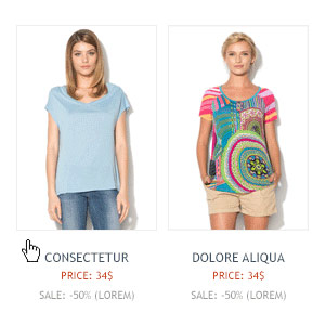
Hover styles add an extra fun element to your email design. They are also a great way to help your subscribers navigate and interact with your email. We all are used to this functionality and we understand it well.
With image rollovers when you move the mouse over a certain image, the hover effect turns the image so you could see its flipside. This is a very useful functionality when displaying apparel products, as we show in our example above.
Image rollovers save space in the above-the-fold part of your email and allow your readers to access more information without scrolling down.
When creating an image rollover the design concept should be to create a style that fits the rest of your email design, but is different enough so that users will notice it with a mouse-over.
It would be great if you manage to make your users move around your email looking for other elements that might react on hover.
Tabbed Content & Collapsible menus

Tabbed Content

Collapsible Menus
Tabbed Content
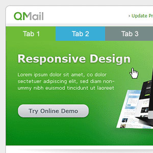
Tab menus in email do great job as they serve like small, internal navigation menus. They allow you to fit a lot of content in the email without cramping the design. Tabbed navigation is also easily recognised and most users are intuitively familiar with how it works.
To design effective Tabbed Menus we recommend following these 5 rules:
- Tabs must look and behave like tabs. Your email subscribers already have good experience with using tabs in real life and online and they have certain expectations on how they should look and behave;
- Place the navigation tabs at the top of your email. This is where your email subscribers expect to find them;
- Only have 1 row of tabs: Stacking tabs on top of each other, complicates the user experience;
- To add more impact on your tab menu, have one of the tabs pre-selected;
- Clearly indicate the active tab, either by the use of color or by making it larger than inactive tabs.
Collapsible menus
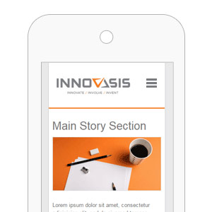
It is great to have the hamburger menu, as it is better known, as an option in email design. It helps for presenting a much cleaner design.
The best way to use it is when you have a menu or content that you wish to hide behind a single button. The collapsable menu will help you organize your content in a way that makes navigation simpler than endless scrolling.
The two most important advantages of the collapsable menu are that 1) it is very recognisable and 2) the hamburger allows for direct navigational access.
It is no secret that there is a heated debate about the use of the hamburger menu in the web design community. However, like it or not, this tiny icon has turned into a symbol of the hidden menu. Users understand it and while many designers don’t have much love for it, we all end up using it anyway.
CSS Animation & Animated GIFs

CSS Animation

Animated GIFs
CSS Animation
Email newsletter design and coding is an ever-changing medium and its techniques are constantly advancing.
Thanks to CSS3 it is now possible to create animations and interactivity just with CSS, which allows for creating animations in email newsletters. This is fantastic as animation has gained so much popularity in recent years.
Bear in mind that you don’t really need a complex animation to impress your email audience. Even a subtle motion in your email design can really excite your users, increase engagement and ultimately increase your conversions.
Animated GIFs
The animated GIF is a very interesting interactive element. Most people think of it as suitable only for distributing funny memes, however, we clearly see a resurgence in the use of animated GIFs in email design and in digital marketing in general. Traditional looped gifs, animated logos and mostly product presentations are all very popular.
GIFs are smaller than video, more engaging than still images and their simplicity is driving their increasing popularity. Low-fi, small in size and limited in length, email designers are being forced to innovate by the restrictions of the medium.
Simple GIF-style animations are fairly easy to create and upload. All you need is a great idea that matches your email message.
Conclusion
The development of these interactive techniques help email to compete successfully with social media and the more traditional marketing channels. It allows marketers to prepare more eye-catching and user-friendly email designs for their clients and subscribers. The development of these tools also shows that email is not stale and that the email community and the ESPs are working towards modernizing email, expanding its features and providing more and better email tools to its users.
MailBakery specialises in all 6 advanced techniques. If you wish to discuss your interactive email design, you may submit your query from our Interactive Emails page.
