Master of all things email – ensuring accessibility
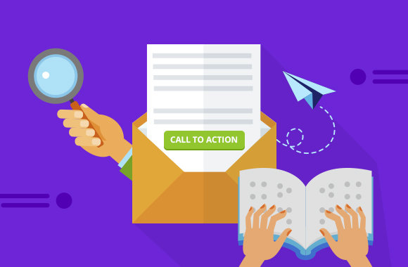
Reading Time: 5 minutesJust when you thought you had the clever wit and artistry to create the most enticing emails, we have a wrench to throw into your world – email accessibility. It’s not necessarily a wrench, however an additional layer of awareness when designing your emails. Think of today’s blog as a way to open your eyes to ensure that those with impairments won’t ever miss your message again.
What exactly is email accessibility?
It’s a step farther than making sure your email can be read on desktop and mobile devices. There is another group to take into consideration when designing emails. This group’s of those with disabilities. These people may have limitations to what they can see in your emails. They may also require assistive technologies to read their emails.
According to the National Eye Institute, by 2030, 2.2 million Americans will be blind and 5 million will suffer impaired vision. Millions more suffer from eye diseases that temporarily or permanently affect their vision.
Visually impaired

Technology is available to remove vision obstacles by making the text readable by:
- Magnifiers to make text larger for visually impaired readers.
- Screen reader software that reads out text for the visually impaired or converts information into a Braille interface.
Mobility impaired
These readers require assistive technology to aide their navigational obstacles:
- Joysticks to improve ease of hand movements.
- Sip and puff technology controls movements by a series of inhales and exhales.
- Eye-tracking technology enables people to navigate and control their computer activities with their eye movements.
Technology advances have made sure that the visual and motion disabled are included in the communication mainstream. Now it’s up to us as email designers to make sure that our emails are compatible with this technology.
From the angle of email marketing, this means an audience you have not yet reached. For emails designed for systems to send follow-up information, it is critical that those with disabilities are able to get all of the information they need.
Improving your email accessibility
Let’s take a look at some of the critical details you can upgrade right now to improve your email accessibility.
Typography and design

When we mention vision impairments, the first thing people often think of is the size of the text. There are no specifics of the ideal text size, but the WCAG suggests that your content should be able to be resized to 200% without sacrificing function or clarity. Relative sizes (instead of absolute) enable clarity when users are enhancing the size to improve the readability of text. A responsive email template adjusts according to their size preferences easily.
More people than you imagine are color blind to specific colors, and there are several types of color blindness. It doesn’t always categorize as a disability, but it creates several limitations to those afflicted.
When designing with this impairment in mind, it’s essential to concentrate not on the color of the text used, but instead, focus on the contrast to be enough that people with color blindness can distinguish the text from the background. A great tool to eliminate all question is the WebAIM color contrast checker.
Another consideration is those readers that are subject to seizure. Animation can be a powerful attention commander when designing emails, we get that. Moving objects are usually received quite well. The dangerous animations are those with flickering, flashing and strobe-like animations can trigger those with seizure disorders. If anything, avoid large images with bright flashes occurring more than three times per second.
Think like a web designer

Email designers should share the same common-sense approach that website content designers do for web pages. With accessibility in mind, similar practices will enable all readers to gain access to your email message:
- Provide transcripts and alternative (alt) text with different types of media.
- Use alt text on all images so assistive technology can give accurate descriptions.
- Provide easily understandable content and explain complex terms.
- Avoid including any critical information inside of images.
- Avoid or be generous with time limits on accessing the content.
Specifically, with emails
Now that you are thinking like a web designer, let’s sprinkle some extra knowledge nuggets to your email design strategy.
Subject lines matter
Just as it does with any reader, you are inspiring your reader to open the email. If they are too long, however, it may be difficult to read at extreme magnifications and be deleted before it gets a chance to make an impression.
Headers matter
This helps readers work out the organization of your email and zero in on critical information to them.
Colors matter
Consider readability of the color impaired and make strong contrasts with text and background.
Labeling hyperlinks
Give hyperlinks a meaningful name for clarity of the reader. Something vague like “click here” may be overlooked or skipped. Instead, try “Mailchimp Accessibility Content Guide” instead, so your readers know exactly where they are about to go.
Accessible email coding
So many email creator programs have simplified the process of email creation by novice users. It helps attract subscribers and sell their product, but it falls short when that message needs to get across all levels of accessibility.
One way to make your email efforts a little more “effortless” is by incorporating HTML code. A well-crafted template with the elements described will eliminate concerns of the accessibility of your emails, and that they are meeting all of the ADA guidelines.
Your happy bakers at Mail Bakery is just the team to get you there and get your emails read. They can string in some elements like header tags to make your emails able to be scanned and easily navigated by your readers’ assistive technology. Your Mail Bakery bakers will help to eliminate questions and doubt over whether or not your email content and design meets all accessibility guidelines.
Bring your design – your first coding is free

We love to give you a taste of our talents, and your first lick of the spoon is free when you bring your own recipe, so to speak. If you have a design laid out and simply need to have someone code it with some special ingredients, that’s right up our alley. Send us your design files and we can get started right away!
