The 6 Best Practices for Responsive HTML Email Design
Reading Time: 3 minutesThis article was last updated on September 1, 2020
Today more than half of all emails are read on mobile and this is a trend that will continue to grow. Along with that mobile users are quite picky and at least half of them will close or even delete an email that isn’t properly optimized for mobile.
To avoid losing clients on mobile you have to use mobile responsive HTML email design for you emails. This includes the use of coding techniques like media queries, fluid layouts and images and customized copy for your mobile audience.
These are MailBakery’s 6 best practices for responsive HTML email design:
1. Layout
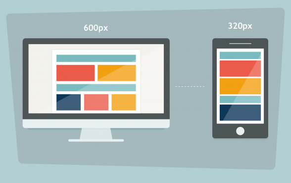
On a mobile-device screen, multiple column layouts usually appear squashed, cluttered and hard to navigate. This is why it’s better to stick to a single column layout.
The single column layout makes your email cross-device compatible and easier to read, even when viewed with different email clients.
Using a single column layout also simplifies your design and highlights the more important parts of your content.
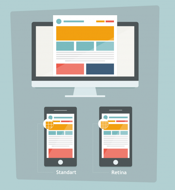
The optimal width when designing for mobile is 320px (640px for retina).
2. Fonts
Choose fonts that are clear and easy to read. If your font size is too small, most people will skip your email. Nobody wants to strain their eyes reading a tiny text.
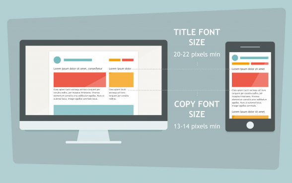
At minimum, use 13 or 14 pixels for the text and 20-22 for the titles. This will make your email much more readable on a small screen.
3. Content
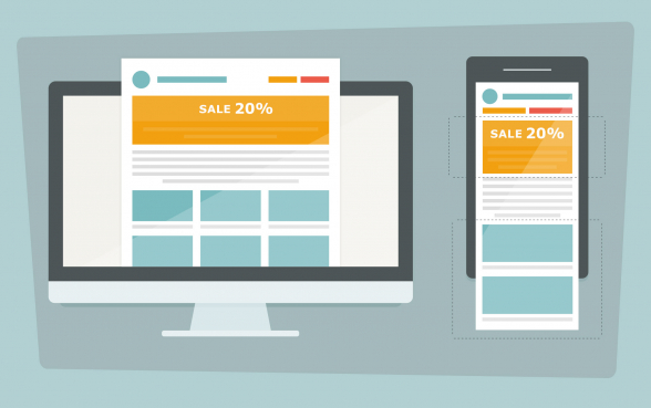
First thing first, place your most important call to action or your most valuable offer (for e-commerce sites) above the fold. People reading on mobile usually skim emails and won’t scroll down to look for the `best offer` or ‘buy now’ button.
In some cases, you won’t have enough room for all the content of your email newsletter in the mobile version, so make sure to include only the most important parts of your message.
If your emails are typically full of products and offers, consider limiting their number for the mobile version. Remember, your desktop assortment doesn’t have to match the one on mobile. Think about user experience on mobile and what’s optimal for it.
Trimming down the content of your email allows readers who are on the go to stay focused on your message and will translate into better conversion rates.
4. Buttons
Buttons are made to be tapped as the user is following a certain conversion path. This means that your buttons need to be large enough so your users could easily tap them.
Display a noticeable call to action that is at least 40 by 40 pixels (preferably wider) to allow the reader to easily engage with your email.
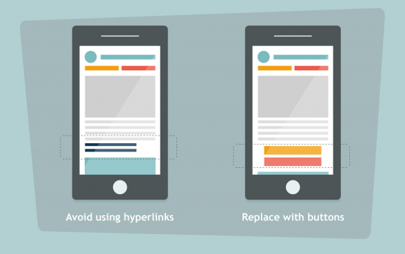
Also avoid using hyperlinks and especially avoid cluttering several hyperlinks together. Taping on them could be quite a challenge. Instead, replace any hyperlinks with buttons.
If you want your clients to dial a phone number, apply the `tap to call` function on it.
5. Images
Usually, mobile devices load web content more slowly than PCs and you have to be careful how heavy your emails are. The images are the heaviest objects in your email and if you don’t want to be losing readers due to poor loading time, you will have to use smaller, responsive images. This will save your readers some bandwidth too.
On the other hand, there are mobile devices occupied with very high resolution displays (like Retina or Super Amoled). To offer users having such devices the expected quality, you have to use twice as large images than your standard mobile images, for those particular devices.
Also, don’t assume that the images will be always seen. Some email clients display images, others don’t. Be prepared for situations like this and include alt tags.
6. Test
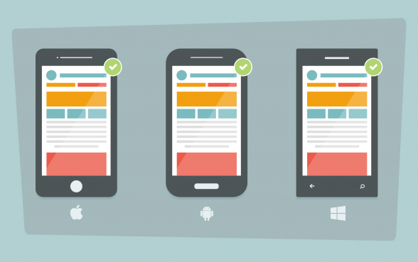
Testing your email is the last and most important step before sending it out to your subscribers. You have to make sure that your designs render perfectly on all major mobile devices. Platforms like Litmus and Email on Acid are popular options for testing your HTML email. However, if possible, it’s always best to test on real devices.
Curious to find out more on how we code and test our mobile responsive html email templates? Click here to find out.

