Welcome Email Design Inspiration: 35 Creative Examples
Reading Time: 9 minutesUpdate July 2018: We’ve added even more welcome email examples for your ultimate welcome email design inspiration. Enjoy!
Welcome email design is probably the most important kind of email design among all. Not only it has the purpose to provide the newly subscribed with valuable info but it also sets the tone of the future brand-customer relationship.
First of all, every Welcome email design should be in tune with the whole brand identity in terms of colors, message manners, and imagery. However, it’s not obligatory to go straightforward with your design. This type of email leaves plenty of room for improvisation. What you need to have in mind is that all Welcome email design elements such as colors, copy, font, choice of imagery, etc. should work in favor of the feelings you want to convey through your template. For example, if your brand speaks of sophistication and class, this is what your template should convey.
In this post, we’ve come up with a collection of various eye-catchy Welcome email examples, diversified in style, colors, and type of imagery. Representing different brands, all of these Welcome email examples are successful in getting the brand message across. So, feel free to compare design styles and draw inspiration, so you can find out what will work out best for your own brand. Let’s begin!
1. Welcome email by Review Australia
The brand bet on a beautiful pencil-style illustration for a background and blocks of text in front with added shadow giving the feeling of depth. The soft pink color and italic font convey purity, beauty, innocence.

2. Welcome email by moddeals
The welcome email design by moddeals looks like an actual letter coming out of an envelope. This digital representation of a snail mail has been mixed with a modern-looking flat design and trendy colors.

3. Welcome email by Steven Alan
The open composition, hand-painted lettering, and the choice of the turquoise textured background make this welcome email design an absolute eye candy. Fashion brands such as Steven Alan must always be on the cutting edge of design trends.

4. Welcome email by Urban Outfitters Europe
A contemporary welcome email design by Urban Outfitters Europe: a short, focused template, an easy-going font, and the color orange as an accent in the copy. This welcome email example contains all the ingredients for a super successful welcome email campaign.

5. Welcome email example by Tory
A modern Welcome email design template by Tory, presenting a classy floral print for the background and a nice, clean white sheet on top. The hand-written “Welcome”, the choice of font, the pictures – all of these elements convey class and elegance.

6. Welcome email example by Hudson
A black and white welcome email design by Hudson boosted with a strong visual content that nails the attention – а full-width photo of models in the middle. The design “screams” dramatic, cool, urban style. This welcome email example perfectly corresponds to the brand’s identity.

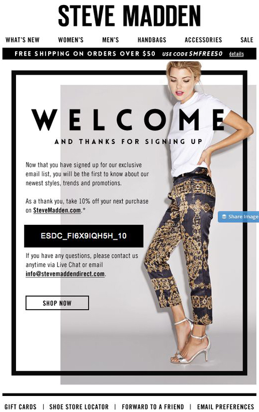
7. Welcome email by Steve Madden
Steve Madden bet on an asymmetric welcome email design with elements interlacing with each other. Modern, elegant and fashion-forward: this is what the recipient “gets” from this design and this is exactly what the brand wants to convey.
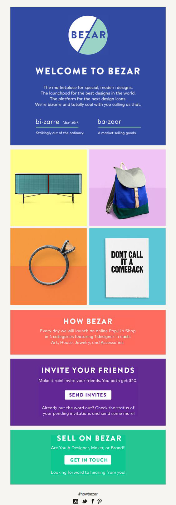
8. Welcome email design by Bezar
Bezar’s welcome email design pops with blocks of bright colors. When you don’t want to use photos or illustrations, color can help you catch the attention of your recipient. This is the strategy Bezar bet on in their welcome email campaign.
9. Welcome email example by Tea
Tea’s welcome email design incorporates several sheets of paper “pinned” to the background, as well as printed photos “taped” to the wall behind, and pieces of cloth. These elements give the feeling for a more realistic rather than digital design.

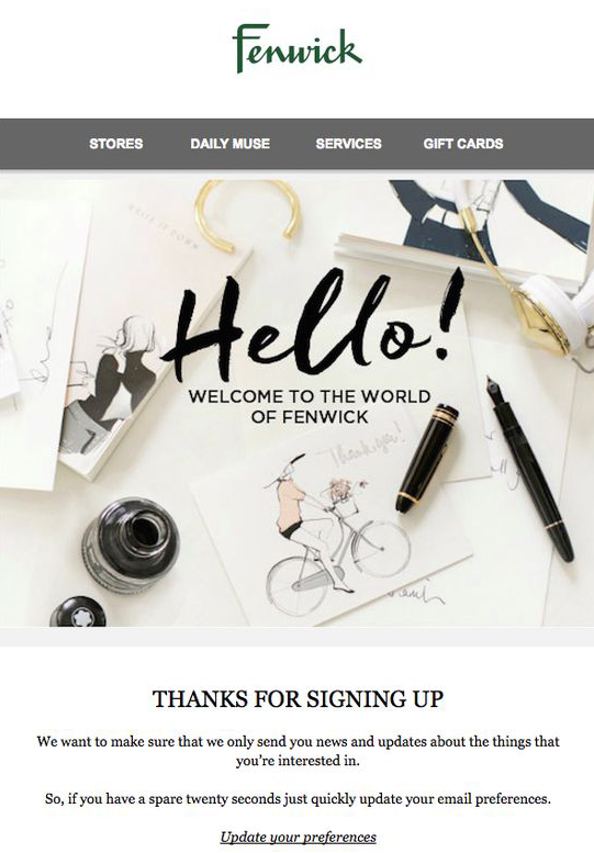
10. Welcome email example by Fenwick
A simple welcome email design by Fenwick including a full-width photo, hand-written greeting on top to grasp the attention and make the recipient read the brand’s message.
11. Welcome email example by claire’s
Claire’s welcome email design is a fun mix of real life elements such as “printed” photos and digital elements such as the rainbow frame. Fresh, fun, light-hearted – this is how this design makes you feel.

12. Welcome email example by The Arrivals
One of the brands that have paid a quite special attention to the usage of fonts in their welcome email design is The Arrivals. Besides using clever copy and a high-quality picture, what makes this welcome email example different is the specific font.

13. Welcome email by John Lewis
A modern and straightforward welcome email design by John Lewis. This kind of design is easy to achieve and works for different brands and industries. John Lewis bet on a high-quality background photo and eye-pleasing font.

14. Welcome email example by Moo
A creative welcome email design by Moo catching the attention with a fun picture and a fresh color combination: green, blue and yellow.

15. Welcome email example by Tiffany & Co.
High class, elegance, feeling special… this is what Tiffany is known for and these are the feelings conveyed through its welcome email design. A wrapped gift box from a close-up and plain text with sophisticated font: Tiffany’s formula of success.

16. Welcome email by The Free People
A pretty welcome email design by The Free People. The brand bet on strong imagery, pretty font, and girly colors. Not only the photo has eye-pleasing and relaxing color scheme but its concept also conveys the feeling of freedom and harmony.

17. Welcome email by Lilly Pulitzer
Fun, fresh, summery – this is what the welcome email design of Lilly Pulitzer conveys through its bright colors and watercolor design elements. With pink prevailing, this design screams – girly!

18. Welcome email by Bloomingdale’s
This welcome email design by Bloomingdale’s is appealing and seductive. Not only the choice of photos but also the choice of colors and the layout of blocks work in favor of conveying elegance.

19. Welcome email example by Upworthy
Here is a great welcome email example with retro effects. Upworthy bet on a vintage welcome email design with appropriate vintage typography, textures, and bright colors. Eye-pleasing, indeed!

20. Welcome email by Trade Coffee
A wonderful example of a welcome email by Trade Coffee who used a full-width enticing picture of cups of coffee and incorporated the text in it. Truly, a tailored welcome email for all coffee lovers.

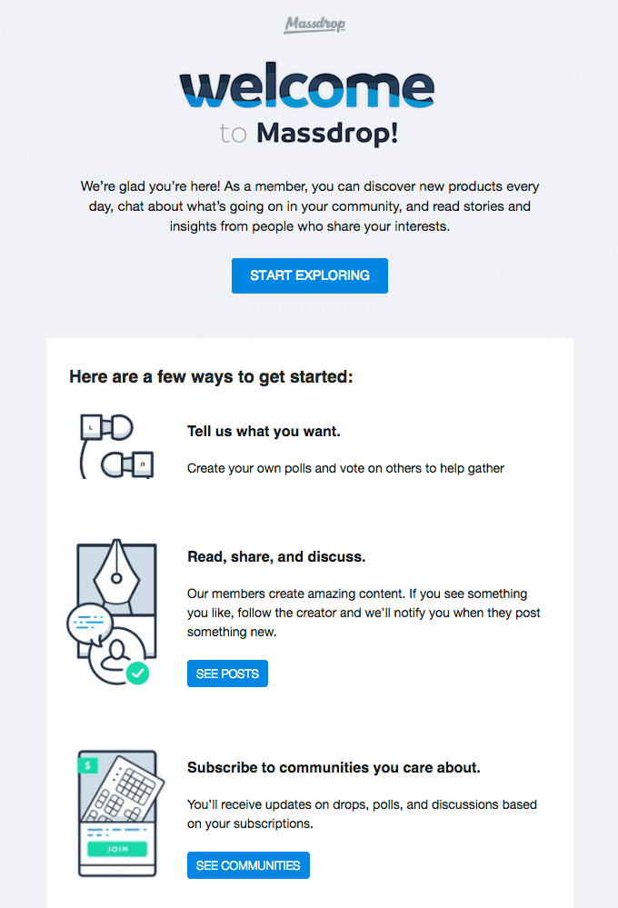
21. Welcome email example by Massfrop
Besides the great outline illustrations we see in this welcome email by Massdrop, what caught our eye was the interesting design of the word “Welcome” made with a negative space technique which is quite trendy in the recent years.
22. Welcome email by Ballpark
A short and concise welcome email example by Ballpark which provides just the basic information for a new user. What makes it different is the fun choice of an illustration – a branded cap which makes the recipient feel they are a part of the team now.

23. Welcome email design by Headspace
An illustrated welcome email design by Headspace including a cute mascot character meditating. This welcome email is a little bit more informative and gives new users valuable instructions on how to start using Headspace.

24. Welcome email by Carnival Cruise Line
A bright, vivid welcome email screaming “exciting”! This welcome email example by Carnival Cruise Line uses attractive high-quality photos and alerting red call-to-action buttons to make the recipient click through.

25. Welcome email by dovetail
Sometimes, a cute, friendly illustration is enough to make the user feel welcome in the brand’s community. Here is what dovetail’s welcome email looks like.

26. Welcome email by Lovely Notes
A really lovely welcome email example by Lovely Notes who bet on a lavender background, bright yellow elements and cute cartoon characters that can simply melt the recipient’s heart.

27. Welcome email by All Recipes
Is there a better welcome email template for a food-related brand than one which actually shows food? We don’t think so, and neither do the guys from All Recipes. A quite visionary and enticing welcome email that simply makes you click.

28. Welcome email by Pretty Little Thing
A very girly welcome email design by Pretty Little Thing that shows many colorful square block sections, each being a different call-to-action button. This welcome email design is indeed quite appealing for the women’s audience interested in fashion.

29. Welcome email example by Wufoo
If you decide to focus on just one call-to-action button in your welcome email design, it’s a good practice to repeat it. See in the example below by Wufoo.

30. Welcome email design by Deed
We absolutely love the doodle-ish style of the illustrations in Deed’s welcome email design. So simple, yet super attractive. An attractive background color and a white font adds to their formula to be different.

31. Welcome email design by Vivino
Besides catching the attention with great colors and illustrations, in their welcome email, Vivino outlined the simple steps for using their service.

32. Welcome email example by ban.do
What a better way to convey feelings and emotions to your recipients than show them visually. Here is a cute welcome email design by ban.do showing a heart-warming picture of girls hugging. We also see techniques like text overlapping pictures.

33. Welcome email design by BBC
Bright full-width sections, arrows that naturally make you scroll, and a bunch of ideas to get you started – BBC sets a good example of how to create your welcome email design.

34. Welcome email by Chefsfeed
What makes this welcome email design different, is the bold choice of neon yellow background. Keep in mind that if you choose such a color, you should minimize the use of other colors. Chefsfeed combined it with black and white.

35. Welcome email design by allbirds
Even a simple outline illustration can put a smile on your recipients’ faces if it is fun and animated. Check out this cool welcome email design example by allbirds. It certainly made us smile. How about you?

Inspired, yet?
We hope this collection of awesome Welcome email design examples really brought inspiration along your way. Show us even more inspiring Welcome emails in the Comments’ section if you are in the mood. Meanwhile, learn How to Craft the Perfect Welcome Email.

