27 Awesome eCommerce Email Template Examples to Inspire Your Email Designs
Reading Time: 6 minutesIn case you already enjoyed our 22 Excellent eCommerce Email Templates collection, here’s its sequel 27 Awesome eCommerce Email Templates.
The strength of ecommerce emails grows as online shopping and mobile internet consumption reach new highs every year. Internetretailer.com reported that U.S. e-commerce grew 14.6% in 2015, reaching $341.7 billion in online sales. Mobile internet, on another hand, allows your clients to stay online wherever they are. So, what would be a quicker and easier way to reach them with your latest offers than sending an email?
Ecommerce emails are a big and important part of the email marketing traffic. To inspire your next email design project we’ve selected these 27 Awesome Ecommerce Email Template Examples for you.
1. Astley Clarke
A beautiful eCommerce email template by the leading British fashion fine jewellery brand. The white background let the light, golden rings, earrings and necklaces contrast nicely. The email offers an up to 50% sale for three categories of products – rose gold, yellow gold and a bamboo collection.
2. Boden
Boden sent this ecommerce email to its youngest fans and their parents to let them show its Back to School collection. The background is smart and funny, a black board with chalk drawings. The drawings surround the whole colorful collection – coats, shirts, jeans, etc. Despite the dark background this email design is a lot of fun.
3. Godiva
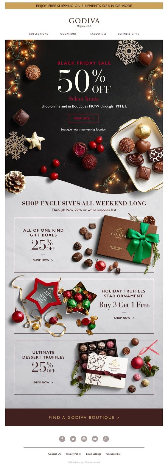
This beautifully arranged Black Friday email comes with the promise of a 50% discount on selected items. You have the option to follow a link to those items or scroll down for few other discount offers. You also have the option to browse Godiva’s standard chocolate collections from a top navigation.
4. H&M
This ecommerce email by H&M displays their summer collection. All items are carefully curated, the email design is light and traditional. Only the prices are missing, but you will be able to easily find them if you follow the shop now links on top and in the centre of the email. You may also check the sales and new arrivals categories from the top.
5. J.Crew
J.Crew show their summer collection in 7 items in this summer ecommerce email. The white background helps the photos to stand out and the spacing between them allows the reader to easily figure out which product he like most and go for it. Next to each pair of images there is a Shop This Look link to a product details page.
6. Starbucks
Here is a great Black Friday email template by Starbucks that offers a ton of goodies on discount to fans and coffee lovers. Their email designer managed to combine illustrations with product photographs thus creating a beautiful email composition, almost like a piece of art. Along with that you can’t miss the price tags and the calls to action, coloured in coffee brown.
7. Styleminded
This colourful Styleminded ecommerce email starts with a big banner on top, offering an up to 74% discount. The colours are very well coordinated and complement each other. Underneath we have the products section. Each section features a product image, short description, price tag and discount percentage.
8. Nike
This Superbowl 50 Nike Gold Collection ecommerce email template is a work of art. It might be just a concept email, but there a lot of ideas you could take from it for your own email campaigns. Despite the vanguard design, the products are easy to find and explore.
9. Agent Provocateur
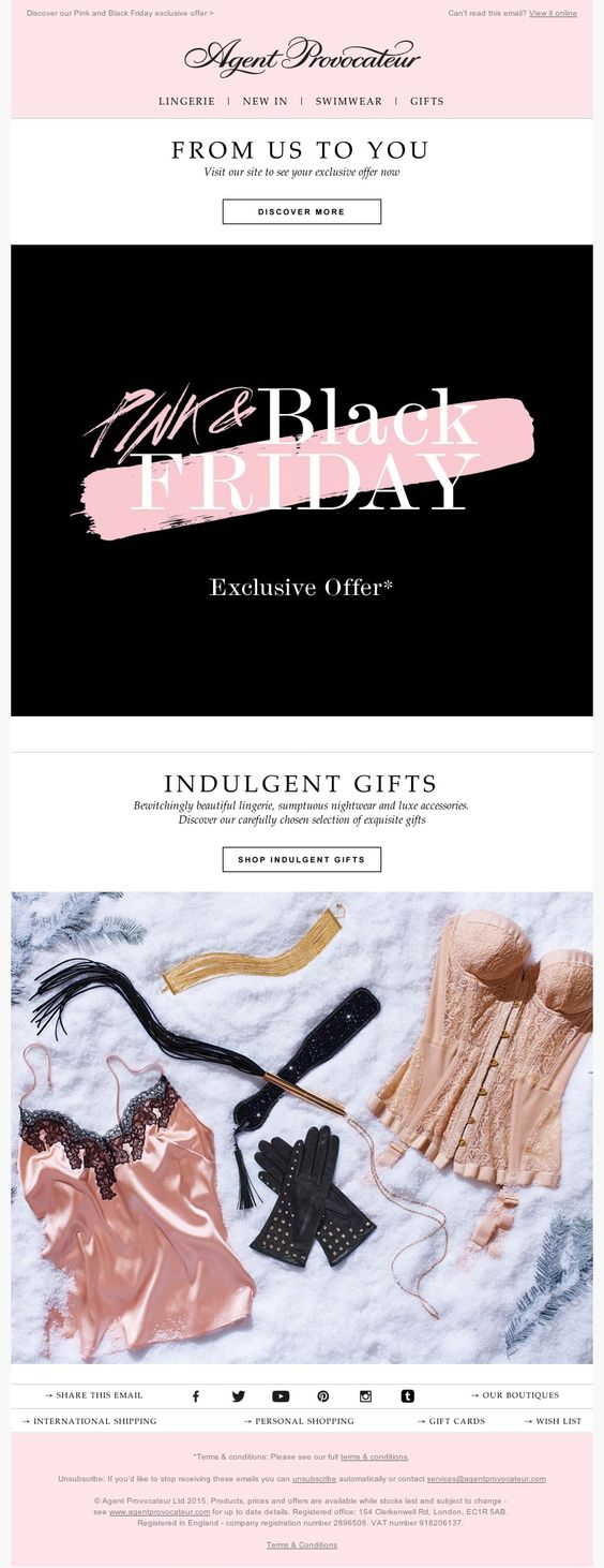
The British lingerie retailer sent this Black Friday email to its clients to let them know of its exclusive pink and black offers. The email features a big Black Friday banner on top and a selection of products displayed underneath with the header Indulgent Gifts.
10. Aritzia
Aritzia’s email designers made a grate choice using design elements with sharp corners on a white background. This contrast allows the reader to identify quickly the different products and to proceed in his direction of choice. The header of this ecommerce email tells you right from the start that you will be presented with 10 of their best offers.
11. Bag Barrow or Steal
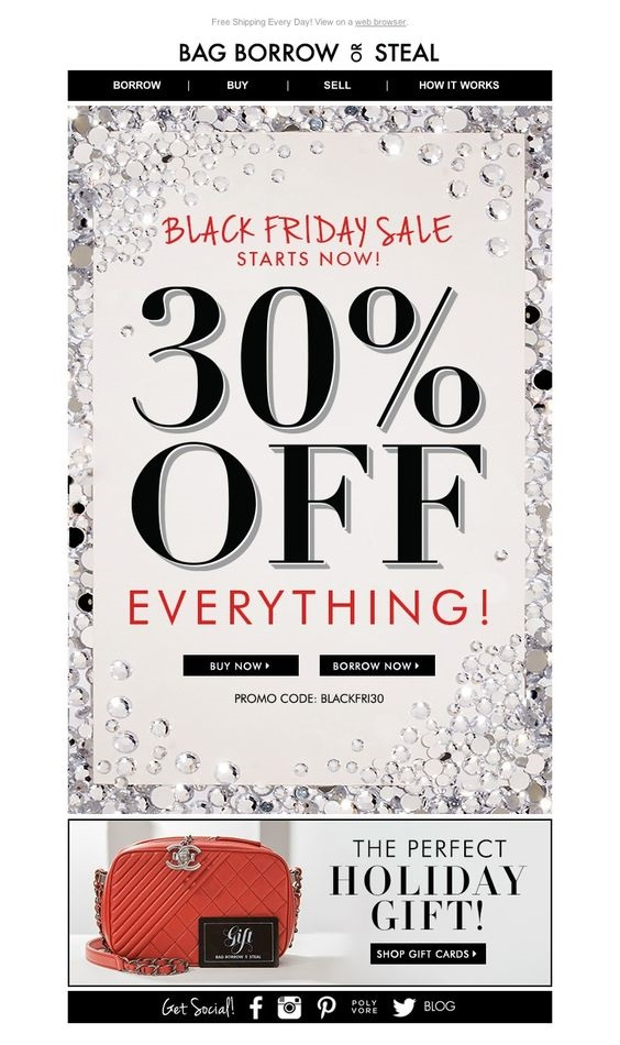
This Black Friday sale email leaves no room for doubt. The main image shows what is on sale (everything) and at what discount (30%). The email body is short and concise with two main call to actions and a promo code underneath. The top navigation confirms the calls to action from the main image.
12. Caterpillar
This is definitely not a standard ecommerce email that you would expect from a heavy machinery manufacturer. Caterpillar is known for its heavy trucks and other construction equipment, but with this email they offer a clothing item – the CAT Boots. The email is designed in the main company color (yellow) and features big images of their main products, but right under them you are given the opportunity to purchase a pair of CATs tough and durable boots.
13. Converse
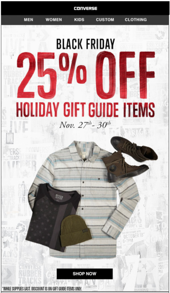
Converse is one of the greatest US casual wear brands and they came up with this sweet 25% discount email for Black Friday. The email is more or less one big image with the main message on top looking as if hand written with a red marker pen. You have a quick menu on top and a shop now button at the bottom.
14. Innisfree
Here is a very fresh and green email design by Innisfree, the leading Korean natural brand. You have big image on top showing what the green tea lucky box includes and a breakdown of the same products in the rest of the email. There are little design touches, like the leaves that appear across this ecommerce email, that complete the main design concept.
15. Look Fantastic
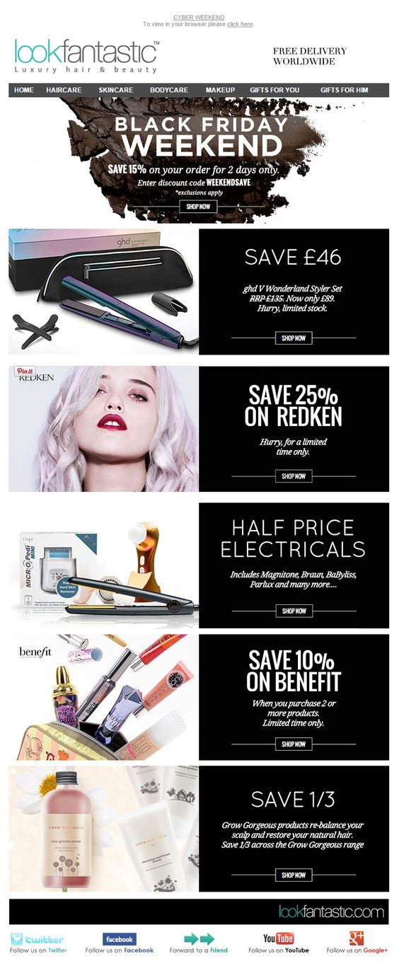
A lot of black color in this one. This Black Friday email by Look Fatastic offers 5 ways to save money with them during the Black Friday weekend. The design elements are big with traditional layout. The black boxes with sale details and shop now links provide quick information on the various deals.
16. Madewell
A summer ecommerce email by Madewell with the slogan Start here, travel anywhere. The greater part of the email is taken by the three photographs displaying apparel products and fashion items. The photographs follow themes arranged around three types of casual hand bags.
17. Mitsubishi
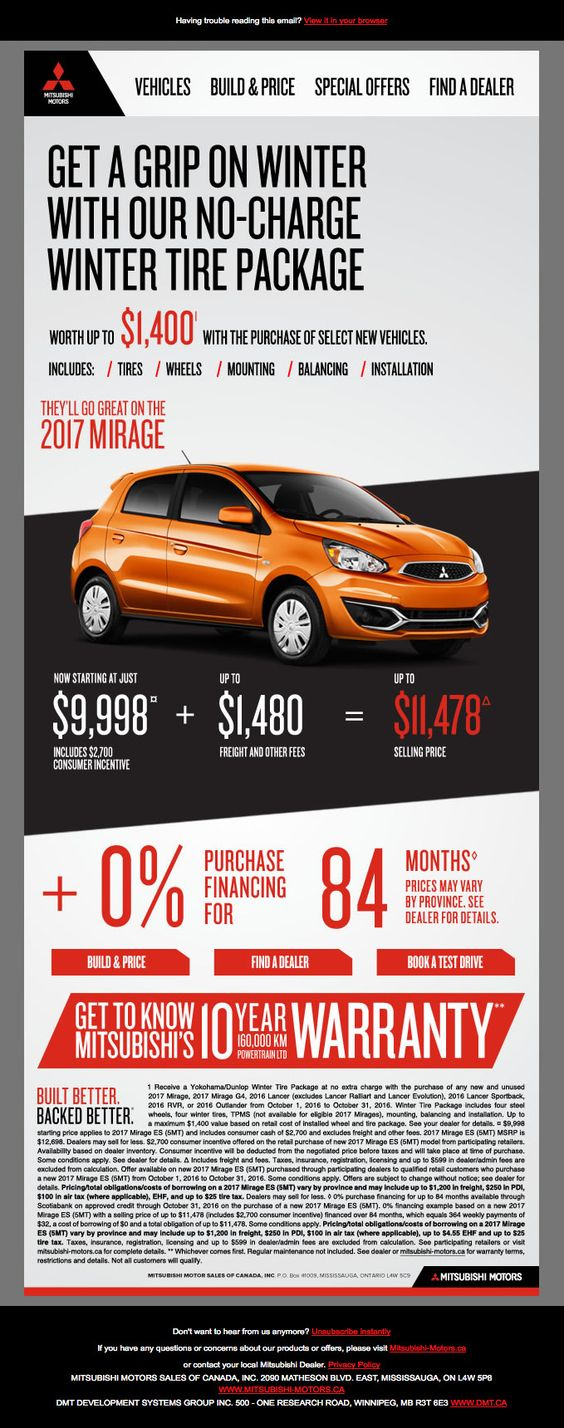
It is no surprise to find a car in the centre of an ecommerce email by Mitsubishi. The 2017 Mirage model is in vivid orange color, arranged against black background. The main parts of the message are in big, bold font. You have links on top that lead you to the various models the company offers and to a page where you could find a local dealer.
18. Net-A-Porter
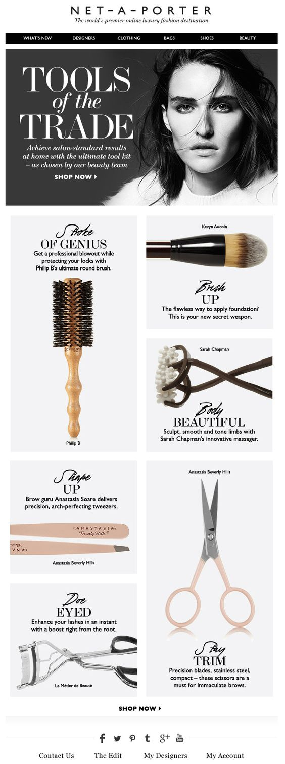
This ecommerce email by Net-A-Porter, allows you to quickly scan its content and easily see what it offers. The email presents the company’s Tools of the Trade product line and you have the option to browse the featured items in more details from the Shop Now button in the hero image. The color scheme is darker and more subtle.
19. Nordstrom
This Nordstrom ecommerce email starts with a navigation menu on top, followed by the slogan of the email What We Love – Right Now and three product categories. Each of the categories features a large photograph of a model, category title and a call to action link – Shop Now.
20. Purses of Paradise
The Purse of Paradise ecommerce email template is all about colour. Purses of Paradise offers the same model in three different color schemes. The images they use are big, bright and each part of the email is well defined. The calls to action are missing from this email, probably the designer decided that those images are so attractive that the user would click on them right away.
21. Revolve
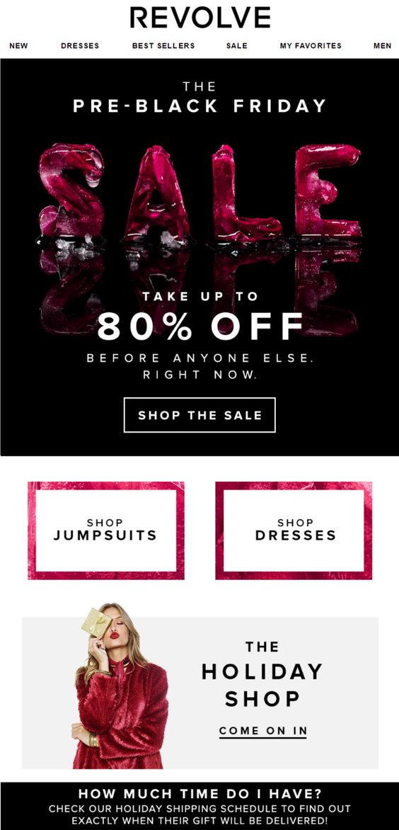
Here is a dark Black Friday email from Revolve. The above-the-fold part is occupied by a big, black 80% Sale banner. The main message is clear right from the start and you have been given three main calls to action – shop the sale, shop jumpsuits and shop dresses.
22. Silpada
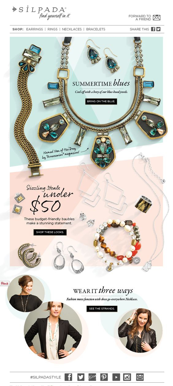
Light and beautiful ecommerce email from Silpada. All the items are beautifully arranged, the backgrounds are pale and non-intrusive. The calls to action are black, which create a great contrast with the rest of the images. You have social media links at the bottom and product categories on top.
23. Amore Pacific Mall
The Korean fashion retailer prepared a Holiday Tea Party email template dedicated to a limited edition line of products. The email features two main colors – green and blue, which split the email template in two parts. The email shows big, sharp images of the company’s products, plus some winter season graphic details.
24. Aritaum
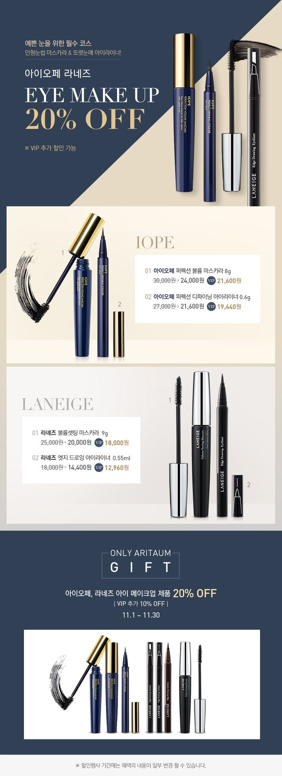
This eCommerce email template by Aritaum features a classic email design, that is simple and easy to navigate through. The design displays big product images, with prices and product descriptions. The main design elements are properly positioned and evenly displayed.
25. Thredup
This Threadup ecommerce email uses white background as contrast to the colourful product category photographies. The email starts with a banner offering a discount of up to 90%, followed by 6 product categories. The calls to action are all in one colour and contrast well to the backgrounds they are displayed against.
26. Unionmade
There is no doubt what this single image email is all about… shoes, spring shoes. There is a single call to action at the bottom of the email, but the composition of the photograph is so captivating that you won’t let it go until you have scrolled down to the bottom.
27. Whittard
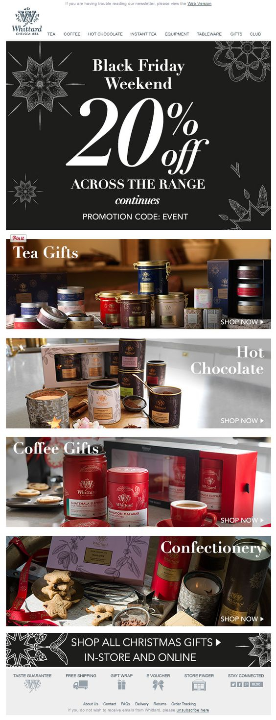
Whittard Chelsea Tea sent this email to its clients for the Black Friday Weekend. All products are on 20% discount and you have to type down “event” with your order to get the discount. The 4 main product categories are listed horizontally, one after another. The footer features links to store locator, gift wraps and free shipping, all accompanied by beautifully illustrated monochrome icons.
Conclusion
The evolution of the email design and coding techniques allows us to explore the boundaries of our creativity. The above email template examples show clearly that there are few limitations in email design left today.
If you have ideas about what your email should look like and you need some help in getting your ideas to life, checkout our Email Template From Scratch service and send us your project brief.


